Do
Images are the most used resource type on the web and represent on average 44% of the weight of a web page in 2022.
Resize images
It is important to resize the images at least to the maximum display size of users.
Do I need a full width image?
What is the maximum display size of my users?
Can I redesign my page to display my image in a smaller size without compromising the graphics?
Choose the right format, but don't forget to minimize and optimize the .svg file using tools like compressor.io
A picture
Use .jpeg or .webp format.
An Image
Prefer vector formats like .svg to .png when possible.
An icon
Use glyphs when possible, or icons and CSS styles.
Compressing images
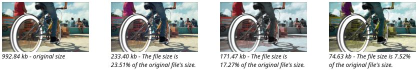
After resizing and optimizing your images, you can compress them before uploading.
To compress your images, you can use tools such as: Shortpixel, ImageCompressor, or TinyPNG.
Be careful to choose correctly the options and the images on which you apply it, because the weight loss is not systematic.
Dither your images
For a raster effect, often a trademark of eco-designed sites, there is also the site: Dither it! https://ditherit.com/
Dither and dithering are english terms meaning trembling and indecision. In the field of computer graphics, where the term has been used since 19643, dither is used for all forms of image processing allowing to render it with a limited color palette
Serving images according to the size of the screen
The concept of "Responsive images" allows you to provide a selection of formats and sizes of images to the browser so that it can choose which one to load depending on the terminal used or the connection speed.
So, after having properly compressed the image, it is recommended to provide it in several resolutions to the developer to store them on the site server: at least one for Desktop and one for Mobile.
One image for desktop
One image for mobile
Delaying the loading of images
This technique, more commonly known as lazy-loading, aims at not loading images that are not yet visible on the screen. The direct consequence of this is a gain in the amount of data consumed since users who do not scroll, do not download the images concerned
Other options
Think of group pictures rather than individual ones, in order to avoid multiplying the pictures.
Define by default a proposal without image and let the user choose to display images on click
Example here : https://lowtechlab.org/fr/actualites-blog
Limit the use of video
The video format is
expensive to produce,
generates high environmental impacts,
excludes people with low bandwidth
poses accessibility problems.
If the video is essential, try to make it as short as possible (less than 1min30).
Prepare 2 different resolutions of your video depending on whether it will be played on mobile or desktop screen.
Identify the right resolution to serve by default :
for a conference, an interview or a MOOC, 480p is sufficient,
for a tutorial, prefer 720p.
What will your video be used for?
Who will it serve?
Is there any other way to do it? Ex : offer only sound for music, put an infographic rather than a video.
Can I make it shorter?
What is the appropriate default resolution?
Have alternatives to streaming (vs. local video) been evaluated?
Can the audio of the video be rendered as text?
Ban video backgrounds and auto-play
A video that starts automatically increases the weight of the page and the total loading time of the page.
Also, this type of practice is criticized for the attention grabbing it generates.
Compressing videos and sounds
There are excellent compression tools available without any perceptible loss of quality.
The compression size must be adapted to the context of use.
Avoid integrating video player plugins
If the video is optional in the page navigation, then it is better to replace it with a clickable image rather than using a plugin that integrates the video into the page.
Limit animations
Animations weigh down the page because they require server calls and resources to be displayed on a screen.
Animations such as spinning tiles, scrolling elements, or a chatbot that appears, are disruptive to users and often cause accessibility problems.
Avoid GIFs and carousels especially in autoplay
A golden rule = any animation must be able to be stopped by the user.
It is therefore essential to provide the animation with control such as start, stop, mute or volume.
Does the animation carry a specific message ?
Can it be replaced by an infographic or a static image ?
Is the frequency of the animation appropriate for the functionality?
Use System fonts
Average size of a web font:
138 KB or 6% of the page size, in 2022
Is there a limit to the number of different fonts?
Are you using system fonts?
If we use the fonts pre-installed in the terminal, then the user does not need to download additional fonts, reducing the use of bandwidth and accelerating the loading of the site.
Use WOFF2 format
Some font formats such as WOFF (the most common) and WOFF2 (the most compressed) have optimized weights that will reduce the weight of the font downloaded by users. Some older versions of browsers do not support the WOFF2 format.
Limit the use of widgets and plugins
The plugins - like social network icons, Google Maps, embedded videos etc - use a lot of resources and can be easily removed or replaced.
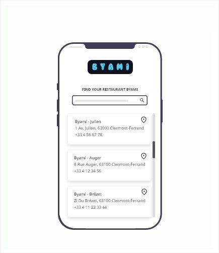
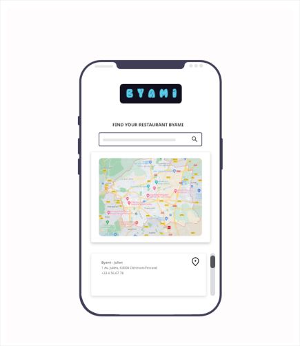
Replace the built-in maps
As an example, the Google Map plugin weighs about 1 MB. When it comes to an interactive map to locate places, consider the use that will be made of it, and replace, for example, by a directory.
Do all users need to load the map?
Given the size of the map on many sites, does the information it provides compensate for its weight?
Can't it be replaced by a link to an interactive map that only interested people would open?
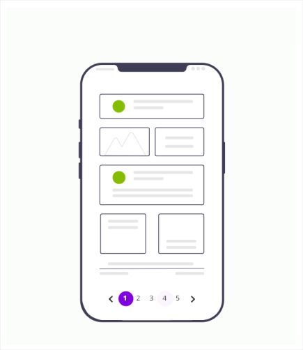
Avoid the infinite scroll
The infinite scroll mechanism is notably used to capture the maximum attention of users.
One of the possible solutions is to replace the infinite scroll as much as possible by an action, such as a pagination, or a "See more" button.
It is therefore necessary to question the right number of elements to be displayed by default to avoid frustration regarding the number of clicks needed to access an information.

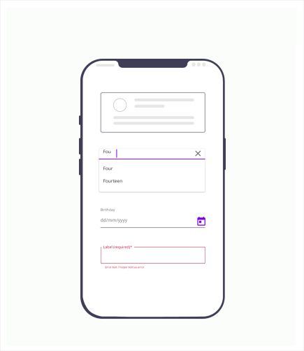
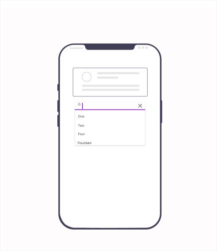
Avoiding autocompletion
Autocompletion or suggestion mechanisms that aim to auto-complete or suggest "smart" options require many requests to the server.
It is better to avoid them or to use existing help techniques (error prevention, examples, input format, etc.) instead.
It is possible to limit the functionality by proposing suggestions only from a minimum number of characters typed - example with 3 characters minimum.
Rework notifications
In a lot of cases, notifications are not used by users. This can be also annoying.
But to consume less energy, we can rethink how we provide notifications.
Think about the different formats of notifications according to their degree of urgency.
Allow users to customize who, when, and how they receive notifications.
Propose an SMS notification instead of an email.
Avoid unnecessary confirmation emails (e.g. unsubscribing from a newsletter).
Replace a confirmation toaster with a status change. For example, a toaster indicating that a new item has been created can simply be replaced by a state focused on the new item.
Forms are generally used to collect data. In addition to the issue of protection and management of personal data, the transfer of unnecessary data contributes to an increased environmental impact.
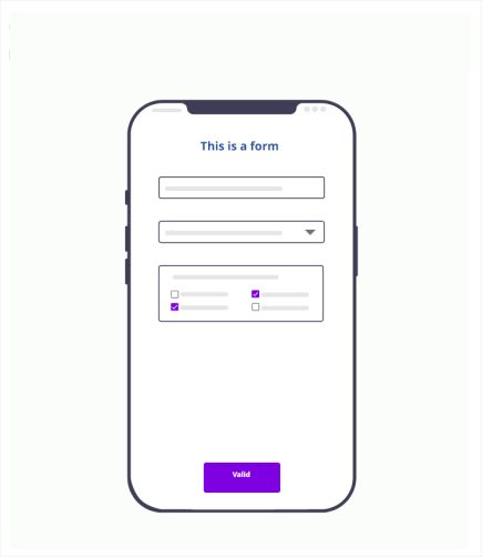
Limit the number of fields
Ask only what is really necessary.

For which purpose do I need to send this form ?
Have we minimized the number of fields (e.g. are the non-mandatory fields necessary)?
Is the data checked for validity before submitting the form?
When pick lists are available, are they limited to values relevant to the service user?
Does the form allow the user to disable dynamic functions (e.g. auto completion)
Optimize and compress documents
Choose a lower resolution and avoid over-quality of documents to be uploaded
Provide a summary
Provide a description or a short summary of the document directly in the page.
You can also provide 2 versions of a document, a short version constituting a summary and a long version containing all the details, without forgetting to indicate the weight of each.
Examples
Propose an image to download like in Michelin content center:

Propose a report to download with the different possibilities and their weight:
Complete report (PDF, 716 Ko)
Synthesis report (PDF, 289 Ko)
Infographic (PNG, 222 Ko and PDF, 319 Ko)
Conference of the study (YouTube link, 1h30 and PDF associated 963 Ko)
Are the documents to be downloaded compressed, optimized and accessible?
For a long PDF document, is it possible to download it chapter by chapter?