Introduction
Introduction
Data visualization consists in communicating figures or raw data by transforming them into visual objects: points, bars, curves, maps... Data visualization saves a lot of time in the appropriation and analysis of data. It is also a powerful communication tool.
'A picture is worth a thousand words' - Confucius
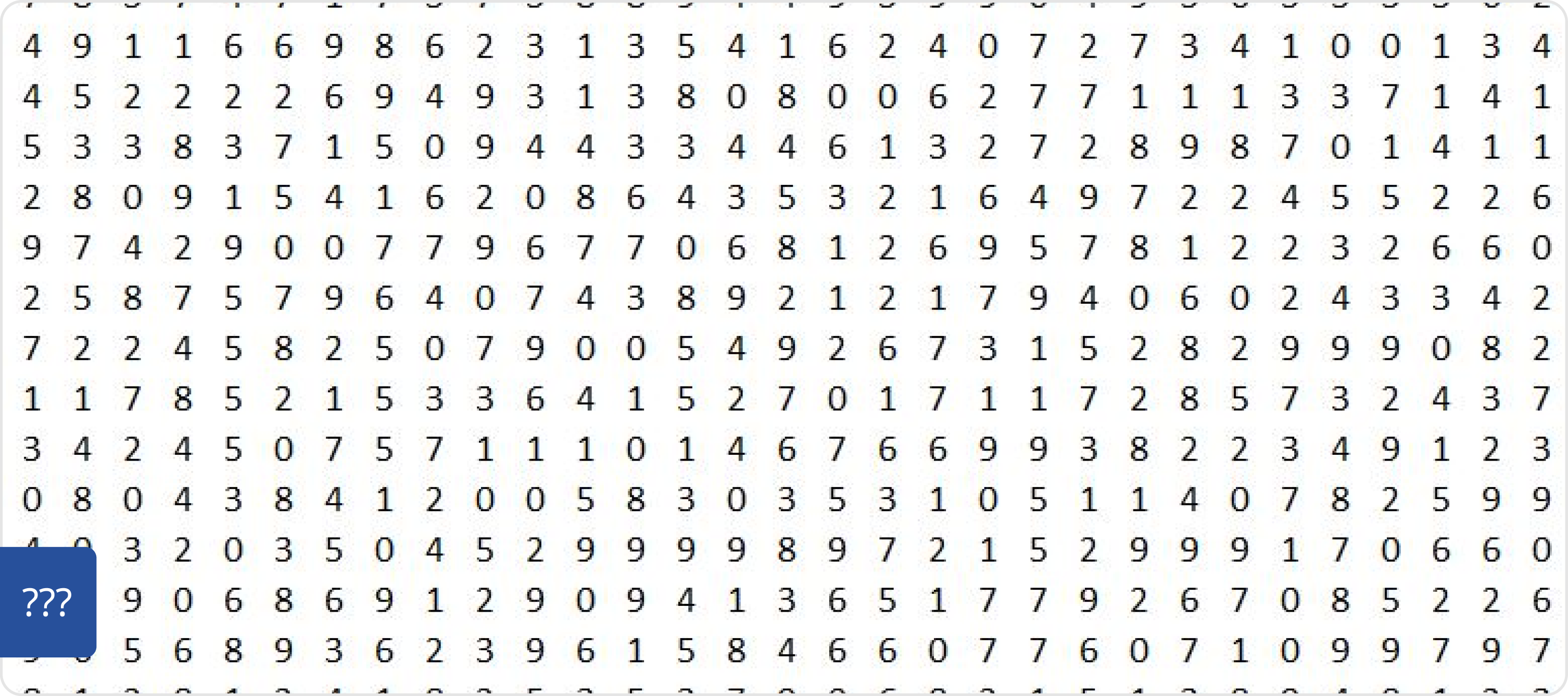
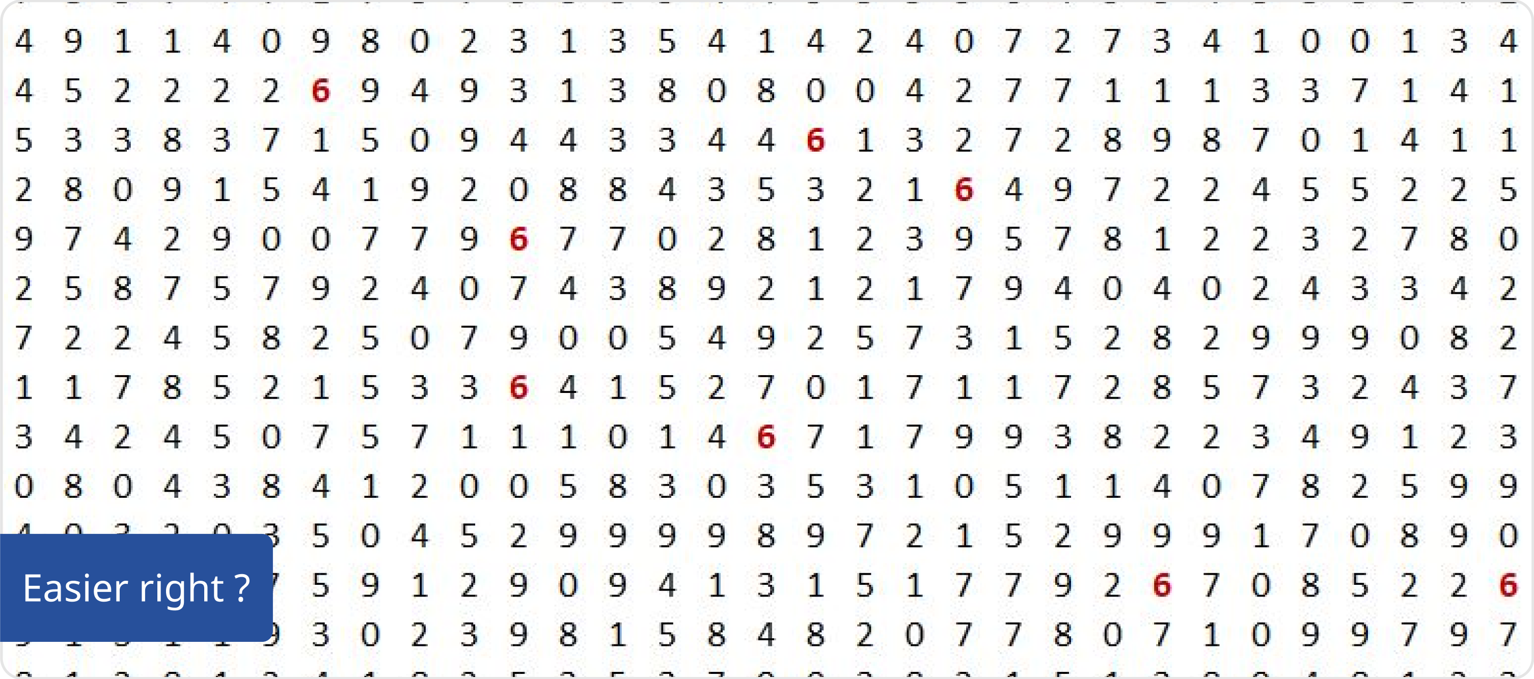
For example, how many 6 you have in this serie of numbers?
Principles
The right chart for the right purpose. Each way you look at data will tell you a different story. Finding the right angle of data presentation is key to convey the right information leading to the right decision. Given the goal of your users, you need to pick the right type of representation. And there are lot of them out there!
Colors are information
Do not use color to make your chart pretty. Use color to make information stand out from your data and make sure to use one color per data. Keep accessibility in mind and do use contrasting shades to maximize readability.
Primary blue - [light]
#27509B
Yellow - [light]
#FDEA33
Green - [light]
#45B9A5
Orange - [light]
#FF9100
Blue - [light]
#40AAFA
Purple - [light]
#7F00E0