Do

A bar chart provides a way of showing data values represented as vertical or horizontal bars.
Bar chart are used for :
Comparison Among items
Show ranking
Show trend
Recommandations for a perfect bar chart :
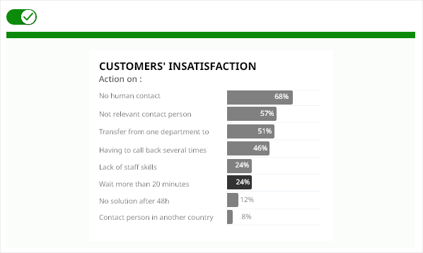
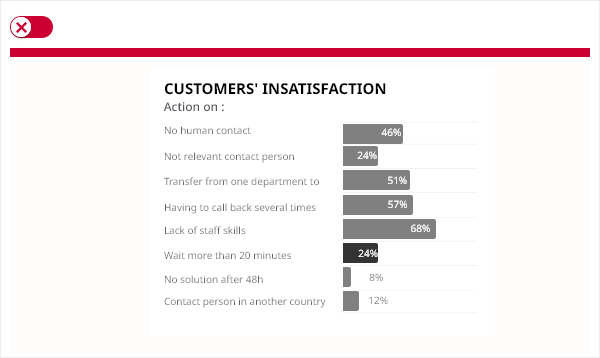
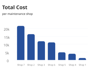
Ordered bar chart reduce eye movements, and time required to read a chart.
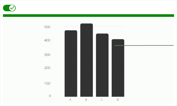
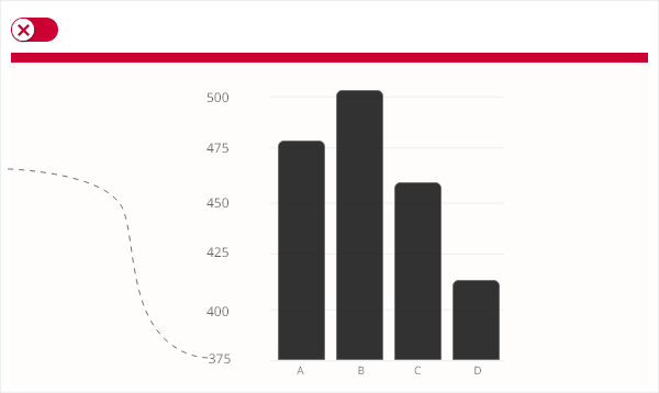
Always start a bar chart at 0 baseline.
Truncation leads to misrepresentation.
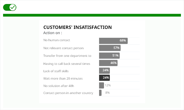
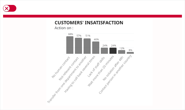
Use a horizontal bar chart instead of rotating labels.
Comparing parts of a bigger set of data, highlighting different categories, or showing change over time.
Have long categories label — it offers more space.
If you want to illustrate both positive and negative values in the dataset.
If you’re using multiple data points.
If you have many categories, avoid overloading your graph. Your graph shouldn’t have more than 10 bars.
The bar chart is a diagram in which the numerical values of the different variables are represented by the length of bars of equal width. The bars are drawn horizontally (along the x-axis) whilst the data labels that describe them are situated on the y-axis.
