Accordion

Angular

See content

Blazor

See content

Accordions allow users to toggle the visibility of a content.

Usage

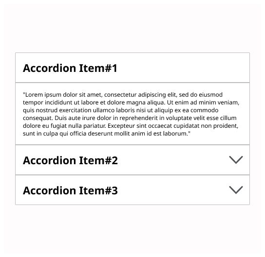
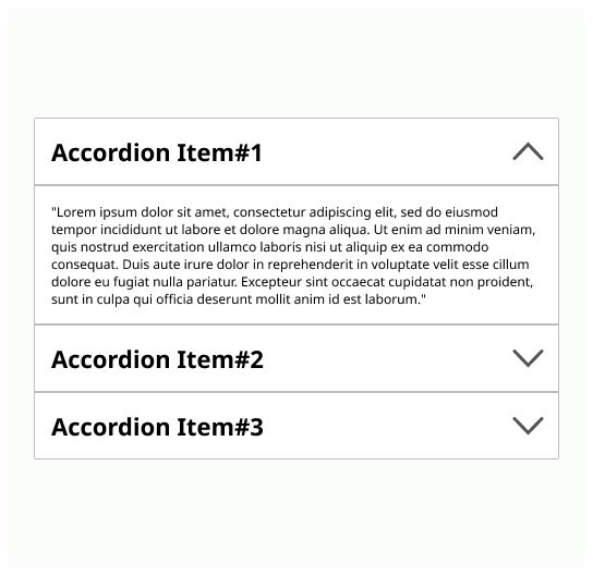
An accordion is a vertically stacked list of headers that allows the user to toggle the display of associated content.

When to use

Use it when you need to display a lot of different information and the user doesn’t need to read it all. It is also used to reduce scrolling on the page.

Anatomy

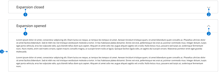
  1. Header: A title that indicate what type of information is on the accordion. It should be short, clear and descriptive.

  2. Icon: An icon that indicate that there is content hide by the accordion.

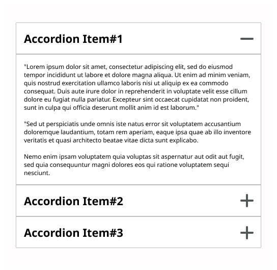
  3. Panel: The main information.

Placement

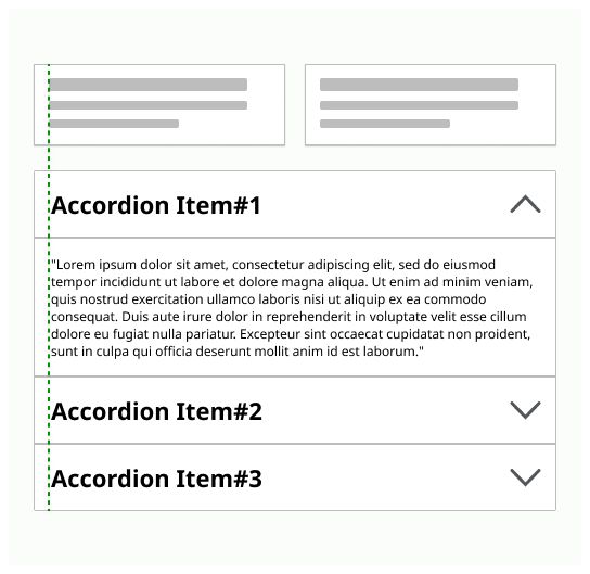
Place the accordion on the main area of the page. An accordion is wide as the area of the text where it is placed. Placed the icon on the end side of the header.

Do’s & Don’ts

If a user is likely to read all the content, then don’t use an accordion The user should be able to close and open the accordion on click on the header or the icon. Users can trigger a state change by pressing “Enter” while the header area has focus. Don’t put long texts on the accordions. One or two paragraphs, a picture is enough. Don’t use an accordion to reduce the amount of content

Do

Locate icons at the right, like this, accordion text will be aligned with the content on the page.

Don’t

Don’t locate icons at the left because it will produce a misalignment with the content on the page.

Do

The user should be able to open and close the accordion with a click on the header or on the icon.

Don’t

An accordion should always be accompanied with an icon for allowing user to close it with this feature.

Do

Use consistent and understandable icons representing what the user can expect when this one will click on the area.

Don’t

Don’t use icons that can be confusing for the user.

Do

Keep content inside the accordion like one or two paragraphs and a picture.

Don’t

Don’t insert too much text. Long text will be hard to be clearly displayed on screen or could discourage user to read the content.

Log in

Log in with Michelin ID

To connect to the Design System, I will need:

  • A Michelin ID (e.g. F012345)
  • Double authentification (with the NetIQ application or by SMS)
  • A password associated with your Michelin ID

I don’t have a Michelin ID and/or email

In order to connect to the Design System, I need:

  • A user ID or an email
  • A password

If you have never accessed the Design System, you can request access via this link.