Do
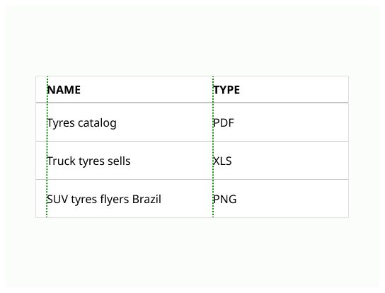

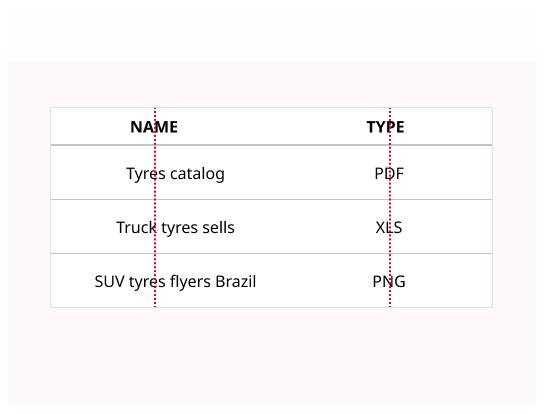
Table enables visualization, comparison or analysis of data across columns and rows.
Tables are used to organize data with a logical relationship in grids. A table makes it efficient to look up values across multiple categories and allows the user to compare information in rows and columns.
Table can contain:
Interactive components (such as checkboxes, buttons or menus)
Non-interactive elements (such as badges or status)
Tools to query and manipulate data
Use tables when:
Exact values are useful to know.
When an item has 3 or more interesting dimensions of data and when a summary or a graph will be insufficient.
When the data can grow and/or if the user needs to search, filter, or batch operations to process data.

Title and description: contain the data table title and an optional description.
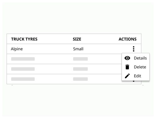
Header: Headers indicate what the rows or columns represent. It also indicates the unit of data on the rows or columns.
Sorting: allow the user to sort the data
Row: contain the data
Columns: contain the data
Pagination: Number of pages of the table and button to navigate across them
Filtering & Search: allow the user to manipulate the data

The title should be speaking in the sense of the user's understanding, rather than in the system's language and make it clear what type of data the table contains.
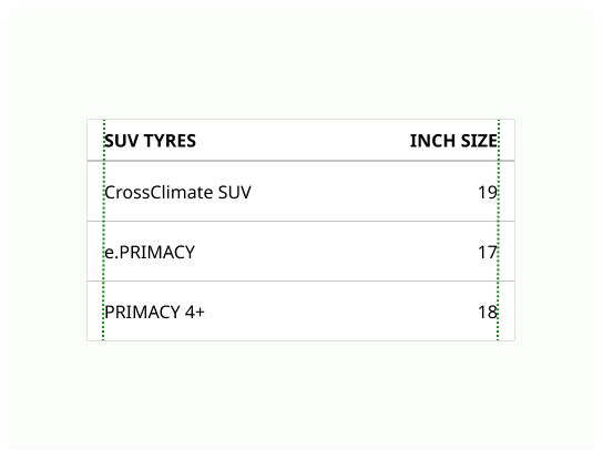
Headers indicate what the rows or columns represent and must stand out, for example in bold.
They should be short (one or two words) and aligned with their related data.
The height of the header row must be the same as the height of the content.
The header provides clarity if data is non-descriptive or ambiguous. Tables should always include table headers.
Sorting controls improve data tables usability. Sorting controls are located in the column headers and indicated with an arrow or a chevron icon.
A sorted table has 3 states:
unsorted (no icon)
sorted-up (chevron-up + accent color)
sorted-down (chevron-down + accent color)
The icon indicates the current sorted state and is only shown if sorting is activated.
If the data is numerical, the default sorting order is 0 to XXX. If the data is alphabetical, the sorting order will be A to Z. It could be reversed with one click. If the content is not sortable, the functionality is deactivated.
Can be expanded or collapsed by an icon button containing a chevron icon.
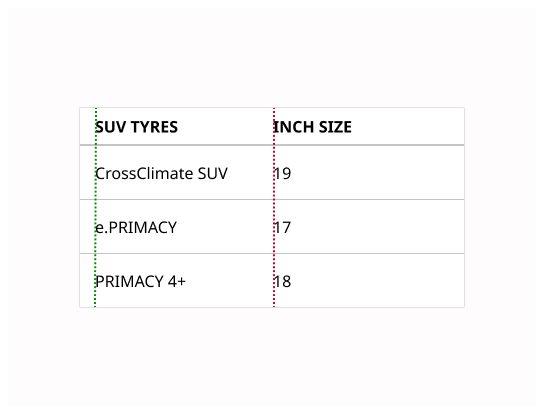
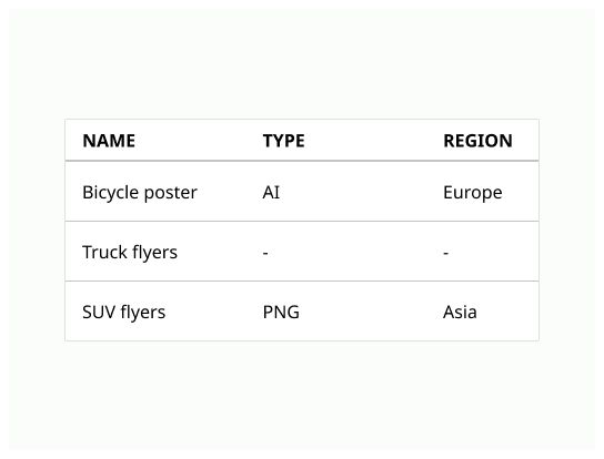
Numerical data is often right aligned. Text data is left aligned. Columns should be ordered by priority or in a way that tells a story with the data.
Prefer using pagination (see the pagination component) in cases where the user is searching for specific information due to its flexibility as it allows the user to skip straight to the last few sets if required, otherwise prefer infinite scrolling.
Any filtering controls that manipulate the dataset should be placed directly above the table with the option to clear all data. It is also possible to use built-in filters in the table column headers.
Tables should be placed in a page's main content area and given plenty of space to display data without truncation.
The user should be able to interact with the table, so he can customize how data is displayed or interacted with.
6 to 8 columns per table should be the maximum, depending on the resolution.
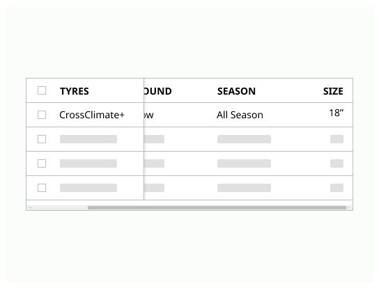
If horizontal scrolling can't be avoided, freeze the column that identified the rows.
Don't use table as a replacement for a spreadsheet application.
A table is used to display data, its goal is to display information and make some edits, not to change every data one by one.
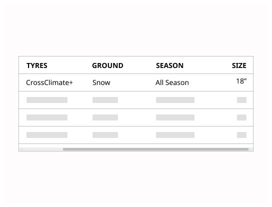
Avoid horizontal scrolling as much as possible