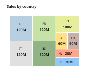
Treemap Chart

A Treemap allows to visualize the information in a tree-like hierarchy. The data are organized in branches and sub-branches. It also displaying quantities for each category via area size. Each category is assigned a rectangle area with their subcategory rectangles nested inside of it.
Introduction
TreeMap chart are used for:
Composition
Distribution
Recommandations for a perfect TreeMap:
Don’t annotate more than 3 levels of the hierarchy, it would make the figure unreadable.
Prioritize the highest level of the hierarchy.
Interactive version really makes sense for treemap.
Usage
When to use
A treemap is ideal when your data needs to be showcased and analyzed in the context of two quantitative values, each unit of which is represented by one rectangle.
When you have an enormous amount of data that needs to be squeezed into a limited amount of space.
When you require a high-level summary or need to simultaneously look at multiple parameters.
When to avoid
If your data sets vary in magnitude
Negative values are not acceptable
Anatomy
The objective is to view a very large amount of hierarchical data.
A TreeMap is represented with :
each color represent a category, a level of hierarchy
one or several rectangle for each category and the size represents the corresponding quantity.
it's possible to have severals rectangles in one color. It can show the different sub gorup of one level / category.