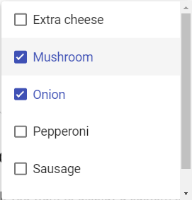
Multiselect
It is the same as the basic dropdown, except the user can select multiple items. It’s important to explain to the user that he can select multiple items and how.

A dropdown is a list of items which allows the user to select one or multiple item in it.
Dropdown has multiple uses and shapes, but the main element is always a list of items. It can be used on form, to filter, to sort content or in a menu. They are interactive elements.
A dropdown can be used in a form when you must display a list of more than five options that the user can select. It depends on the space of your screen, direct access on clicking is faster than open and go through the list.
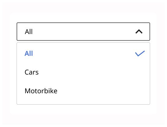
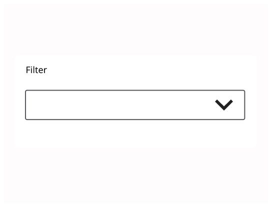
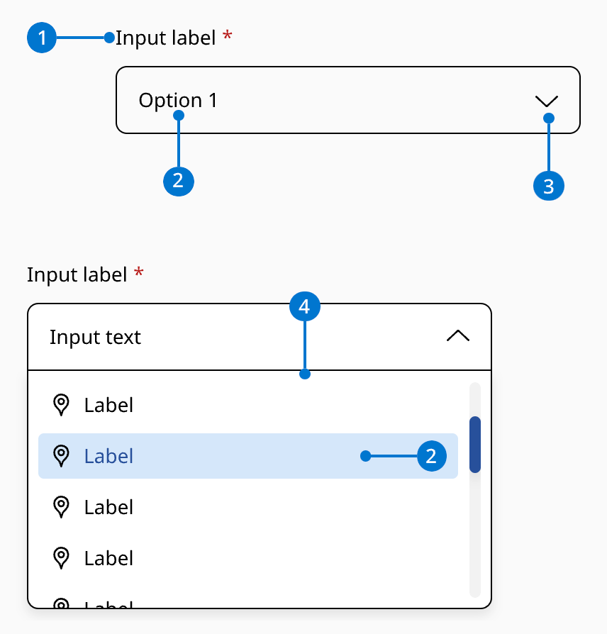
Label: Text that indicate the information type of the dropdown
The selected option: A default option when the user just displays the content, or the option selected by the user
Arrow: Indicate to the user that he can display more information on clicking on the dropdown
The list of options: Text must be in one line. And if the user can scroll, it must be indicated. Information on the dropdown must be keep short and clear.
On hover option: An option when the user has his pointer on it.
The label should be speaking in the sense of the user's understanding, rather than in the system's language. The label must be short. The label can be accompanied by an icon.
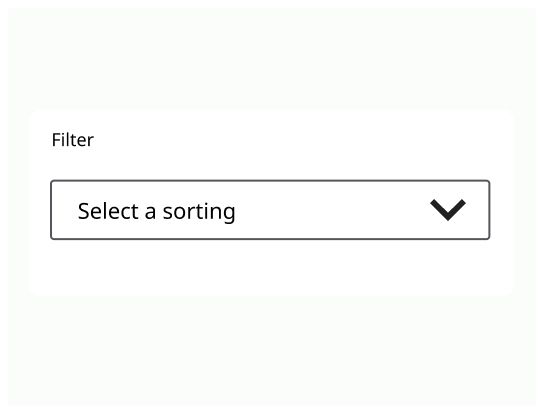
A preselected option should be used or use a placeholder that encourages selection. On mobile, the list will be take all the place on the screen to allow the user to select an item easily.
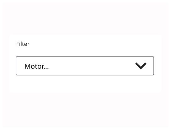
The text of every option should be in a single line. The options should be sort logically (alphabetically, incrementally, by order of importance, etc.).
The basic dropdown is a list of elements where a user can select one.
It is the same as the basic dropdown, except the user can select multiple items. It’s important to explain to the user that he can select multiple items and how.
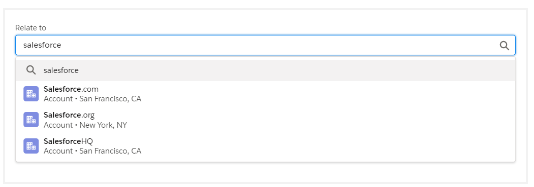
To find the item the user wants to select, he can also write in a textfield merge with the dropdown. The combobox allows the user to add their own text if he can’t find the right option.
The lookUp is a type of dropdown for long list, where it could be hard to find the item that the user is looking for. The user starts input and auto-completion helps to identify if the item is part of the list. If the user can’t find the item he wants on the list, he can add his own.
The lookUp can have different behaviors at the opening. On click on the input field, the items list can be in direct access, but it worked fine only with a small list of items. The second behavior is when the user type in the input field and click on ok. The list will only display items that match his search. Attention, the loading time must be short, almost invisible for the user.
When the user clicks on a tab of a menu, a dropdown with more menu options and/or links can be display.
When the mouse is on it, the menu must stay displayed. The menu will disappear only when the there is no focus on it.

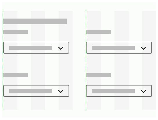
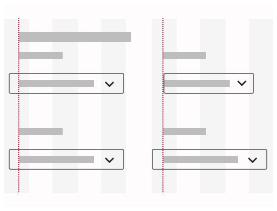
The dropdown should be aligned with the rest of the element on the grid. The list of items must be aligned with the element that showed it.
The user must be able to open the dropdown with pressing “Enter” and navigate into with the keyboard’s “arrow Up” and “Down” and select an item. The user can also close the dropdown by with “esc(ape)” key.
A dropdown is collapsed by default.
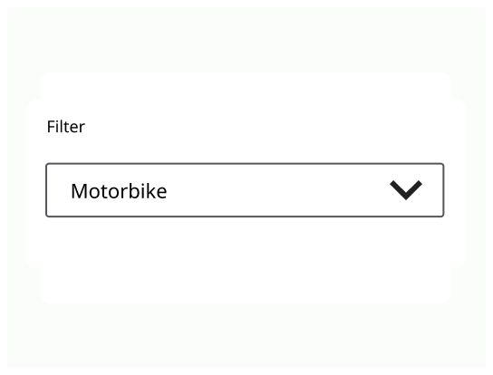
When the dropdown is closed, it either displays the current selection or placeholder that encourage selection if there is no selected item.
A dropdown starts in a compact state and expands to show a list of selectable items.
The maximum height of a dropdown should be at least one row less than the height of the app. On hover or on click, the dropdown should be display.
When display, the dropdown is on the front behind every element.
A dropdown displays his content vertically and the user can scroll up or down to see and select the content.
The list of items must stay displayed as long as the user has the cursor on the dropdown.
On mobile, an item must be at least one centimeter high to be easy to touch with a finger.