Default
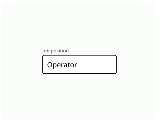
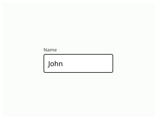
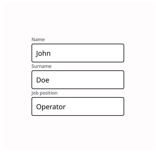
The default appearance of the textfield, a simple box with a label.


Textfield is a component which allows the user to enter text on it.
Textfields are on a single line.

Use textfield when:
The user needs to type information in the system.
In a form to allow the user to enter information before submitting it.
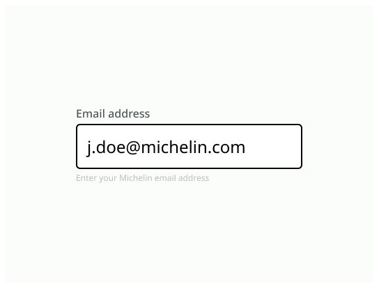
Use a single text input to limit the amount of text to enter. You should specify the expected format in the title, such as number or email address.
If you need to display more text, use a textarea instead.
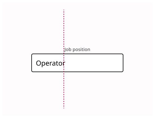
Label: Text that indicate which type of text the texfield must contain
Input text: The text typed by the user.
Input box: The frame that contains the text typed by the user.

The label should be speaking in the sense of the user's understanding, rather than in the system's language. The label must be short. The label can be accompanied by an icon.
Use “label” and give information on the purpose of the text field
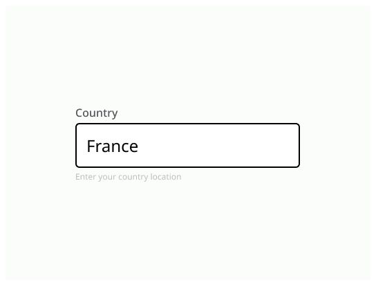
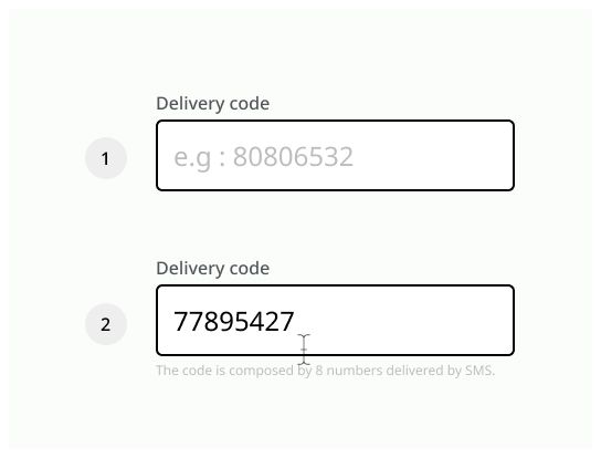
A placeholder can be placed in this area, but it can’t be the only source of information to indicate what the textfield must contains. When the user start typing, the placeholder must disappear.
The placeholder must not be the only way to have the information display by it.
The size of the box must be adapted to the appropriate value requested by the textfield.
The default appearance of the textfield, a simple box with a label.
The textfield is highlighted when the user clicks on it and can type inside.

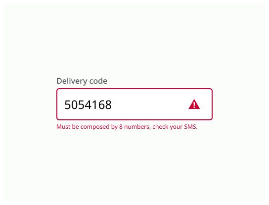
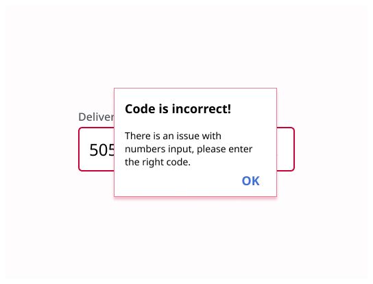
If the user enter something that is not expected by the system.

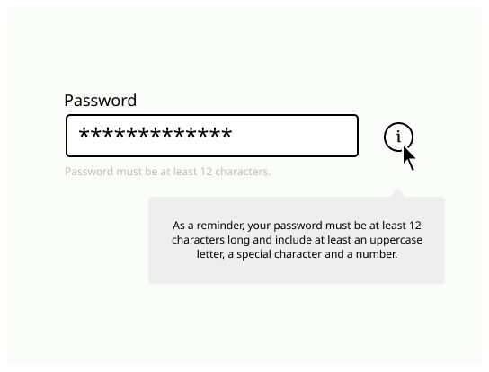
A textfield can be mandatory in a form. It must be indicated clearly with a text beside the label (example: “mandatory”) and an icon in option.

A textfield where the user can’t click on it and can't type text.

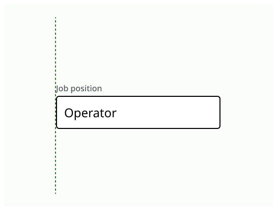
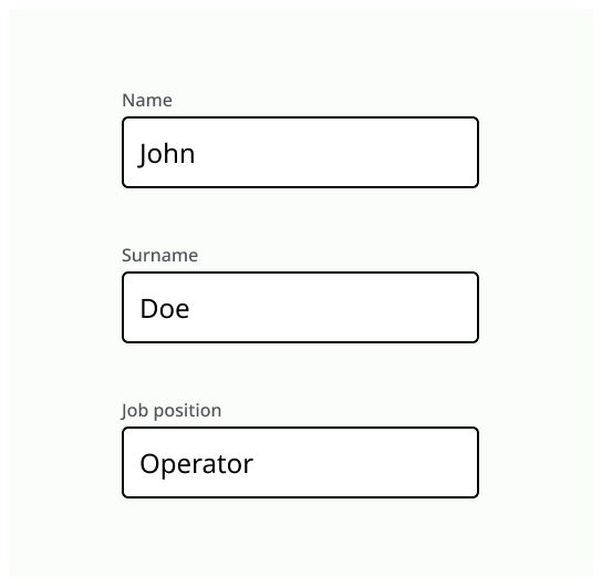
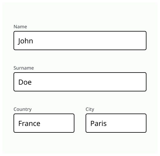
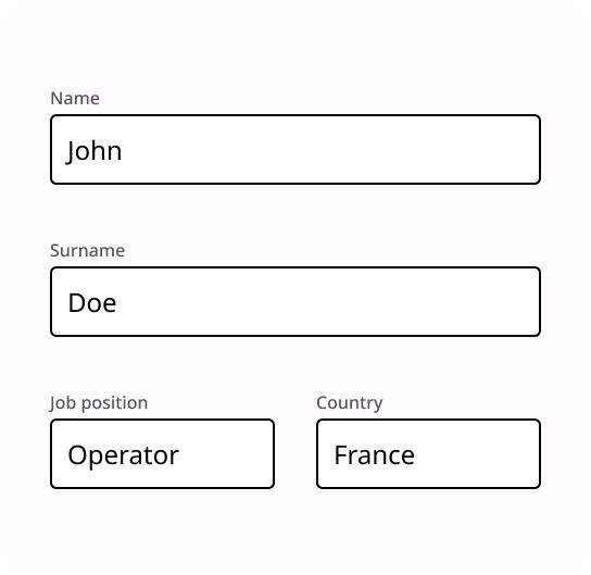
In a form, the textfield must be aligned vertically with the other elements of the form.
The user must be able to navigate between the textfields with the “tabs” key.
Field size should be adapted to the appropriate value.
If the number of digit is limited, it must be indicated.
Always put a label with a textfield.
Align the textfields with each other.
Don’t use only placeholder to pass on information.