Accent
Accent button is used for the most important action to the screen. The button’s color contrast with the rest of the interface to attract eyes of the user. There is only one primary button per screen.


Buttons are interactive elements, they allow users to take actions and make choices
Buttons are call to action, present on almost all interfaces. They allow users to interact with your system. They can have different shape, size and color. They are interactive elements.
If the user must trigger an action, like:
Submitting a form
Beginning a new task or go to the next one
Displaying information hidden before
Specify a new or next step in a process
If this action redirects the user to a new page, use a hyperlink instead of a button.
Icon (optional): Use it to convey more meaning
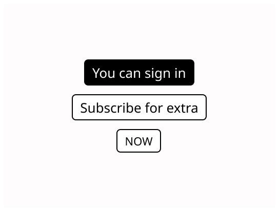
Label: Text that indicates the result of selecting the button.
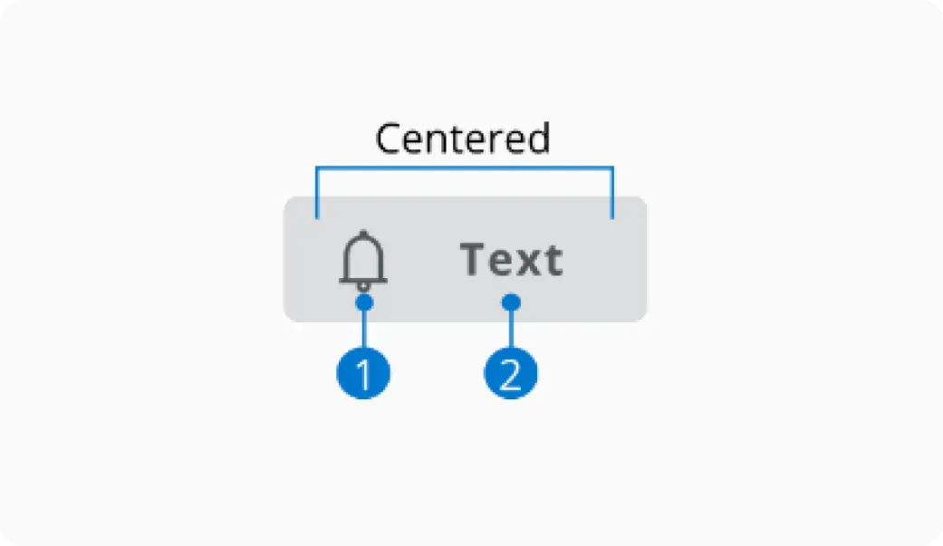
Buttons can contain a combination of a clear label and an icon. The content should always be centered inside the button.
An icon is easier to memorize than a single label if you have large screen. If not, for text buttons, text should be as short as possible, while clearly describing the action that the button performs.
If the button contains exclusively an icon, use content description for describing the action associated with the button.
The label must indicate the action of the button and should be speaking in the sense of the user's understanding, rather than in the system's language. The label must be short.
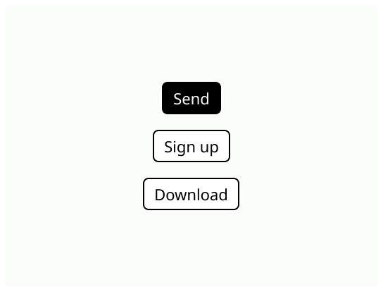
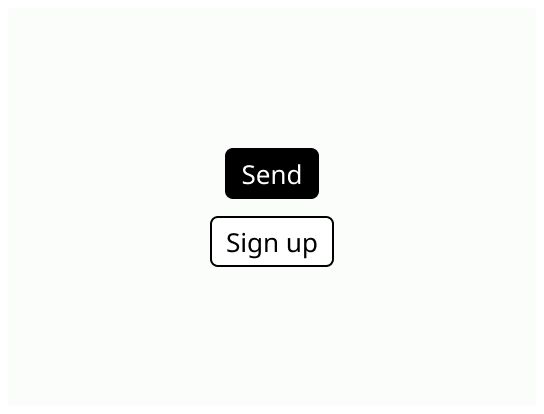
Accent button is used for the most important action to the screen. The button’s color contrast with the rest of the interface to attract eyes of the user. There is only one primary button per screen.
Primary buttons are used for regular actions. It can be placed several times on the same screen.

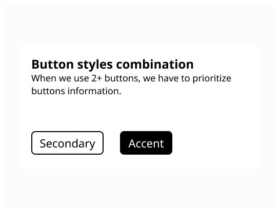
Secondary buttons are used for secondary actions.

Disabled button is a button that can’t be used. Its usage depends on the context. It could be activated if the right data is entered. Use it to indicate that the user can do this action and explain why (for example, with a tooltip).
Disabled buttons should be avoided as much as possible as it has poor contrast and can confuse users.

Generally, the primary button is on the right and the secondary button on the left. It is important to keep the same logic of placement everywhere in your application.
Button with opposite actions (examples: Discard and Save) must be placed together.
🙈 Keyboard navigation: Pay attention to build a logical path through keyboard navigation.