Do

Donut charts are probably the most commonly used charts. They are divided into segments, the arc of each segment shows the proportional value of each piece of data. In most cases, a bar chart is a much better option.
Donut chart are used for :
Comparison
Recommandations for a perfect Donut chart :
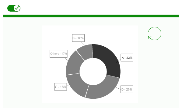
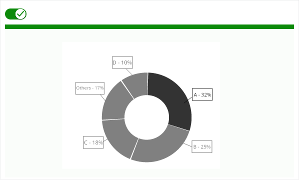
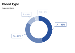
Limit the number of slices displayed in a pie chart (less than 3 category of data).
Avoid when proportion differences are small.
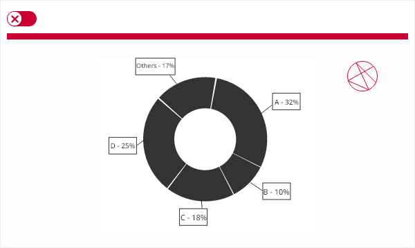
Don’t label on top of slices.
Order slices for faster scanning.
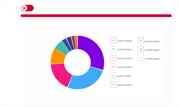
Thin donut charts are impossible to read.
When you show relative proportions and percentages of a whole dataset. Best used with small datasets — also applies to donut charts. When comparing the effect of ONE factor on different categories. If you have up to 3 categories. When your data is nomial and not ordinal.
In most cases 😉 If you have a big dataset. If you want to make a precise or absolute comparison between values.
The donut chart contains : - the donut with less than 3 categories, - the legend attached with the information of the category AND the value.