Do


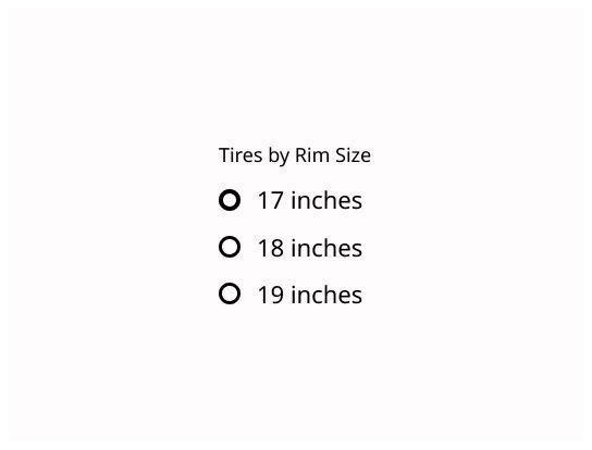
Radio buttons are used when the user can select only one option from a list.
Radio buttons allow the user to select one option among a list of options.
Each option is represented by one radio button, and the user can only select one radio button in a radio button group.

Use a radio button when the user needs to:
Select one answer in a form.
See all options to make a selection, between six or fewer options.
For more than six options or if the available options are unknown or can vary dynamically, consider using a dropdown/combobox.
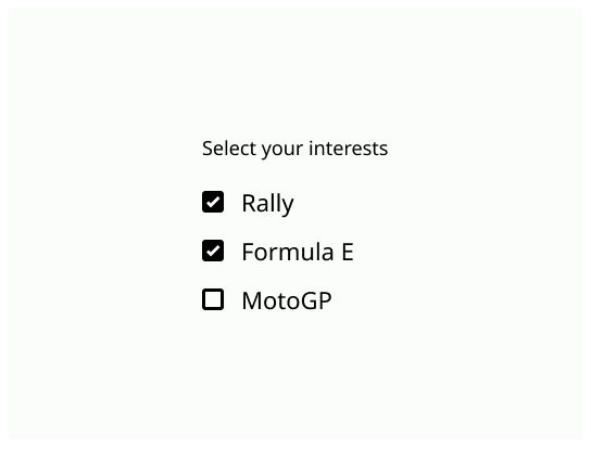
If the user needs to select multiple options, use a checkbox.
Outside a form, if you need to use an on/off option, use a toggle or a switch.
Radio button: The circle that indicate if the radio button is checked or not.
Label: Text that indicate the effect of check the case in the left.

The state of a ratio button when it is unchecked/unselected. It is a small empty circle.
The state of a radio button when it is checked/selected. A dot is on the center of the circle.
The label must be short and be positive to be sure that the user understand that check the radio button would activate the option. When the user clicks on it, it should check or uncheck the associate radio button.
Align the radio buttons vertically, with one choice per line. Only group radio buttons that answer the same question.
See the radio button story
A nice article with a lot of details : Radio Buttons UX Design
Always have a default selected option.
Use a none choice if the user needs to skip selection.
Don't use radio buttons to perform commands or actions.
Don't use radio buttons for yes/no choices, use a checkbox instead.