Principles of a dashboard
Introduction
Creating effective dashboards requires a certain discipline.
Know all the different components of a graph.
Identify the type of data you want to explore and the analysis you want to provide.
Know the basic principles of colors.
Use a basic and structured layout.
Keep in mind the basics Do & Don't of creating a dashboard.
Principles
Anatomy of a chart
Creating an impactful visualization is making sure all of its elements are labelled appropriately.
Like this, your visual should stand alone outside of any supporting narrative.
Having a clear hierarchy in your visual help the reader to understand it faster.
A chart is composed by :
data labels,
category labels,
axis labels,
and other pieces of text on your graph or chart such as Title or Subtitle.
Labels:
clearly indicate at which value each of your axes starts;
horizontal axis labels should be aligned parallel to the axis labels;
vertical axis labels can be aligned parallel to the vertical axis or not;
category labels should be clearly marked too and make sure any words and numbers are easy to read;
data labels are most commonly added as the data value associated with a bar or point on a graph.
Some rules:
Labels can add detail and value to your visualization, but can also overfill and confuse your reader. In order to know if you should used data label, think about your audience;
Where possible, avoid rotating text.
Title / Subtitles
A chart should always include a title and a legend.
The title is an important element of understanding and has to be descriptive and qualitative.

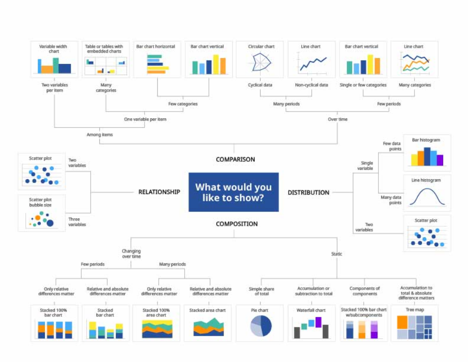
The right chart for the right purpose
Given the goal of your users, you need to pick the right type of representation. And there are lot of them out there!
Finding the accurate data presentation is key to provide the right information leading to the right decision.
Principles of color
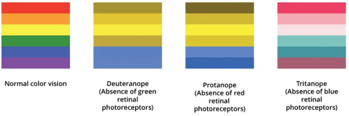
Colors are information!
DOS
Use a unified grey background
Create white cards to place your visuals
Use a panel with a different background for filters
Follow a pattern based on natural viewer's behaviors
DON'TS
Do not use random layout
Do not force the viewer's visual flow
Keep accessibility in mind by using contrasted shades to maximize readability.
Suggested palette
Michelin standard colors
Primary blue (light)
#27509B
Yellow (light)
#FCE500
Orange (light)
#FF9100
Blue (light)
#40AAFA
Secondary green (light)
#45B9A5
Engaged purple (light)
#582C83
Principles of layout
Layout brings structure and readability to your dashboard!
DOs
Use a unified grey background
Create white cards to place your visuals
Use a panel with a different background for filters
Follow a pattern based on natural viewer's behaviors
DON'Ts
Do not use random layout
Do not force the viewer's visual flow
Patterns based on predictable human eye
There are common patterns for hierarchy. These patterns are based on the movements that our eyes tend to make when presented with a fresh page.
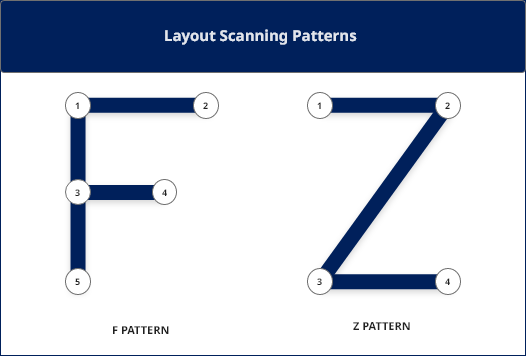
F PATTERN:
With the F pattern, users begin by scanning left to right along the top, but then scan down the left side of the page, looking for visual clues to the information they seek. When they find such a clue, they scan from left to right. They repeat this process until they reach the end of the page.
State the most important information in the header section.
Don’t put important information on the right-hand side of the report.
Z PATTERN:
This of eye scanning is common in western culture. The user scans the page from the top left to top right, then glances down through the content (following a diagonal) to the bottom left, before moving to the bottom right.
Background and cards
We recommend to apply a light grey background. Then you can create cards for each of the visuals you need to place in your Dashboard.
Layout White (light)
#FFFFFF
Layout Grey1 (light)
#F5F5F5
Layout Grey2 (light)
#EEEEEE
Layout Grey3 (light)
#E0E0E0
Layout Grey4 (light)
#BDBDBD
Basic Do's & Don'ts
DOs
Keep it simple!
Let your data tell a story
Place the most important view at the top, or in the upper left corner. Your eye is usually drawn to that area first
Reduce the use of colours to a minimum and other ornaments (like 3D or animations)
Use the right chart for the data with self-explanatory headers and meaningful legends.
DON'Ts
Don't (un)intentionally misrepresent data
Don't use visualizations that don't deliver the message
Avoid mixing pattern layouts
Don't use effects that may obscure the visualization's message
Too much text is distracting, especially if not organized in a visually pleasant way.