Do

Use tabs to allow the user to navigate easily between views within the same context.
Tabs organize content across different screens, data sets, and other interactions
Tabs can be a helpful way of letting users quickly switch between related information if:
Your content can be usefully separated into clearly labelled sections.
The first section is more relevant than the others for most users.
Users will not need to view all the sections at once.

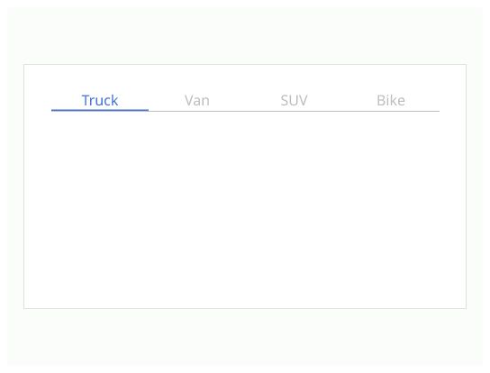
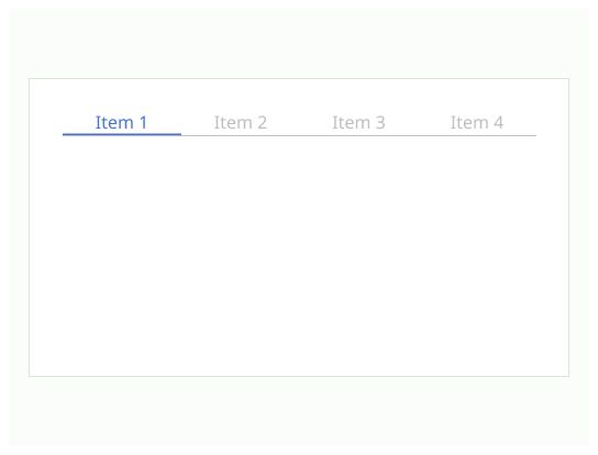
Label: The label should be speaking in the sense of the user's understanding, rather than in the system's language. The label must be short. The label can be accompanied by an icon.
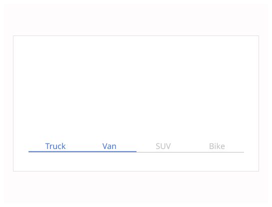
Active label: The label matching the open tab. It must be different from the others tabs to make sure that the user knows what tab is open.
Container: The information that change when the user clicks on tab.
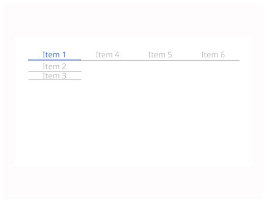
Tabs must be in a single row. Tabs must be on the top of the container.
Keyboard Navigation: The user must be able to navigate across the tab with the tab key.
You could use tabs as item of a menu.
Don't use tabs to move through sequential content that needs to be read in a particular order.
Don't load the entire page for tabs. Only the tabs and their content area should be changing when a user switches to another tab. Nothing else, including the position, should be changing. Users should feel like they are in the same place while alternating tabs.
Don't order tabs randomly. Order them based on user needs.
Don't use tabs to give information about the navigation. it's not a breadcrumb