Segmented buttons

Angular

See content

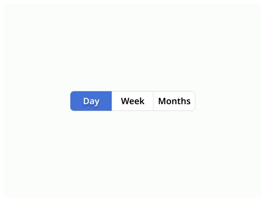
Segmented buttons allow the user to activate or deactivate a value.

Usage

Segmented buttons provide immediate results with no need for validation.

The difference with a checkbox or a radio button is that segmented buttons immediately triggers an effect when being clicked and don't require the user to click Save or Submit to apply the new state. Segmented buttons are CTA's.

Segmented buttons may replace two radio buttons or a single checkbox to allow users to choose between two opposing states.

General guidelines

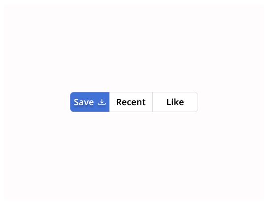
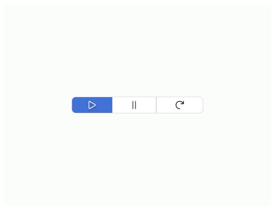
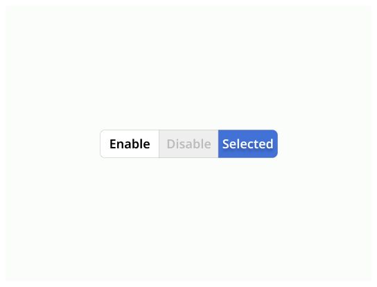
Segmented buttons are generally used to group related options. To emphasize groups of related segmented buttons, a group should share a common container.

Icons can be used as segmented buttons when they allow selection, or deselection, of a single choice, such as marking an item is favorite

Anatomy

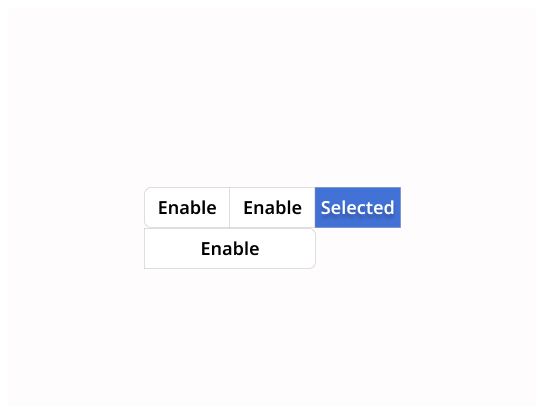
  1. Label: It indicates the purpose of the toggle with a short text or an icon

  2. Selected option: The active option

  3. Unselected options: The other options that the user can select

Do's & Don'ts

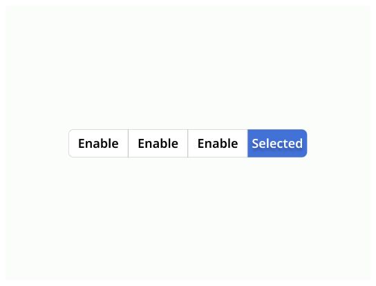
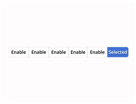
  • Use toggle when the user can select an option between two and five choices.

  • The effect of selection should be immediate.

Do

Inform the user which buttons are active and which are off.

Don’t

Do not let the segments to wrap into a new line.

Do

You should use segmented buttons to choose between 2 and 5 choices.

Don’t

Use up to five segments in a single segmented button. The options have to be defined. If you have more than five choices, think about using a different component, like chips.

Do

Keep tags short and coherent in length.

Don’t

Avoid mixing icon-only labels with text labels. Choose one label type and use that type for all segments.

Do

Multiple selection toggle allow the user to filter or select content showed for instance.

Don’t

Don’t use switch for each item. Select Multiple selection toggle instead.

Do

Icons can replace labels, but they need to be clear about what they mean. Caution ! Use an alternative text or audio description for accessibility purpose.

Don’t

Don’t use unclear icons to illustrate the selection, use label instead.

Log in

Log in with Michelin ID

To connect to the Design System, I will need:

  • A Michelin ID (e.g. F012345)
  • Double authentification (with the NetIQ application or by SMS)
  • A password associated with your Michelin ID

I don’t have a Michelin ID and/or email

In order to connect to the Design System, I need:

  • A user ID or an email
  • A password

If you have never accessed the Design System, you can request access via this link.