Do

Switches are digital on/off switches.
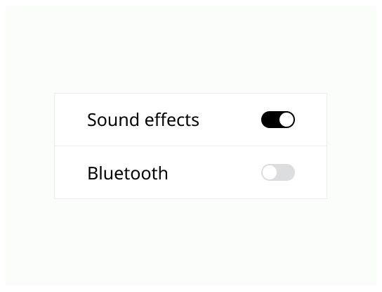
Switches toggle the state of a single item on or off. They are best used for changing the state of system functionalities and preferences.
Use a switch when a user can toggle between two opposing states, such as on and off.
Switch action has immediate results, giving users the freedom to control their preferences as needed.
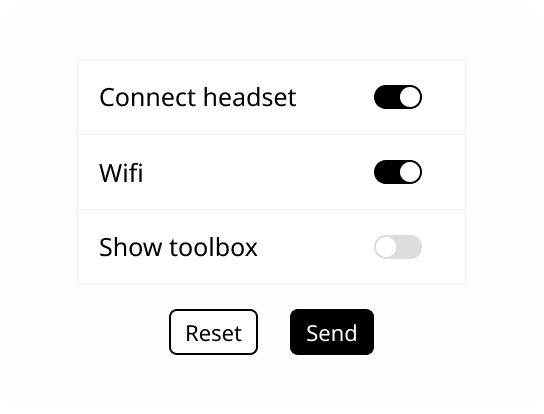
The switch has always a default value, make sure to deliver immediate results that don't require the user to click Save or Submit to apply the new state.
The option that the switch controls, as well as the state it's in, should be made clear from the corresponding inline label.
Avoid creating a switch that includes the text on and off within the graphic itself. The switch alone should be enough.
Put the label above or on the left of the switch (in the reading direction of your users).
Keep labels for toggle switches short and direct, don't use excess phrases. The description should be on what the control will do when the switch is on, don't make neutral or ambiguous sentences.
A switch is successfully toggled when the switch thumb slides to the other side of the track upon user interaction.
Thumb
Track
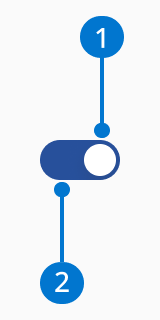
Use the accent color to identify the ON state.
The switch should animate when the user toggles it.
The switch relies on both color and slide for visual cues, there's no need to use the labels on/off.
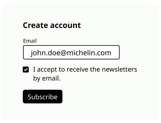
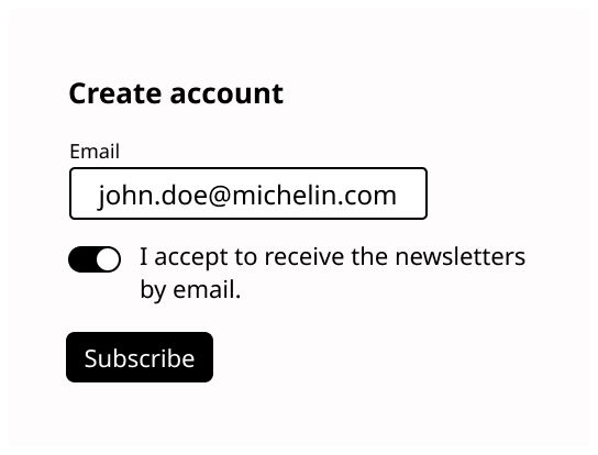
Don't use switch if the result doesn't take immediate effect and needs a validation. Use radio button or checkbox instead.
Don’t use on and off for the switch label.
