Do


A line chart is a way of plotting data points on a line. Often, it is used to show trend data, or the comparison of two data sets.
Line chart are used for :
Comparison Over Time
Show Trend
Recommandations for a perfect Line chart :
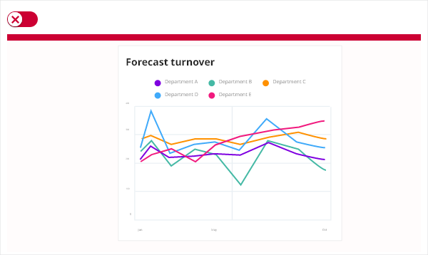
Use adaptive y-axis scale for line charts.
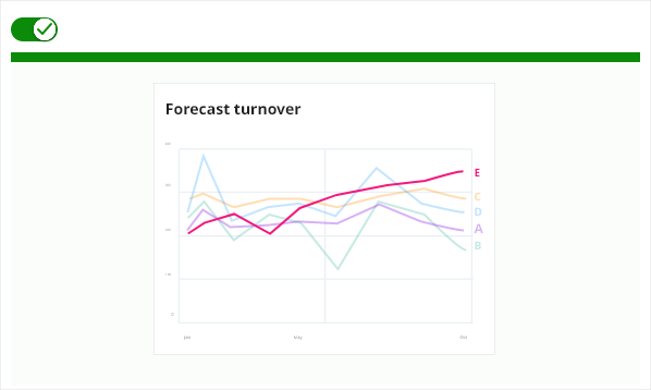
Avoid using smoothed line
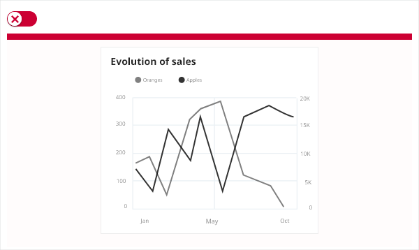
Avoid confusing dual-axis
If you have a continuous dataset that changes over time. If your dataset is too big for a bar chart. If you want to display multiple series for the same timeline. If you want to visualize trends instead of exact values.
Line charts work better with bigger datasets, so, if you have a small one, use a bar chart instead.
The line chart consists of an x-axis and a y-axis. The x-axis values are defined as number or date/time values. Y-axis values must be numbers and can be set to be interpreted (formatted) as decimal, percent, and currency. You can have more than one series of data with each series corresponding to a unique line in the chart.