Alert

Angular

See content

Blazor

See content

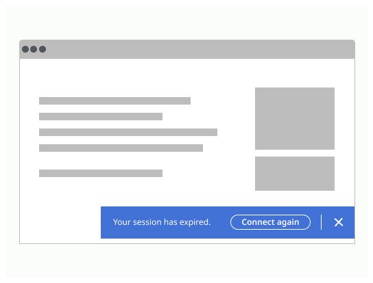
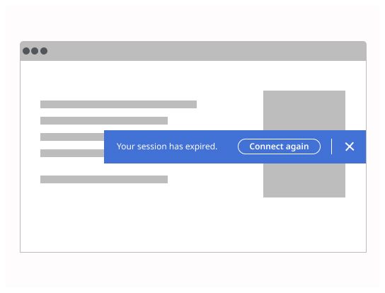
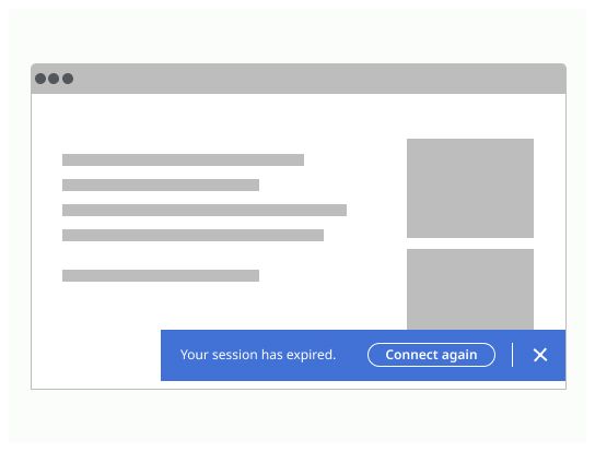
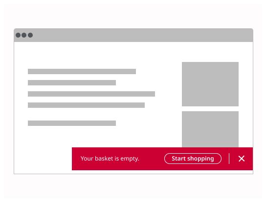
Alert provide contextual feedback messages for typical user actions.

Usage

An alert displays an important, succinct message, and provides actions for users to address (or dismiss the alert). It may require a user action to be dismissed.

Alerts should be displayed at the bottom of the screen. They’re persistent and nonmodal, allowing the user to either ignore them or interact with them at any time.

Deciding what to use

  • Informational

    • usage: Provide additional information to users that may not be tied to their current action or task

    • action: Do not require immediate action and can be dismissed on a timer or persist, depending on the content

    • color: Blue

  • Success

    • usage: Confirm a task was completed as expected

    • action: Typically do not require further action and can be dismissed automatically or persist in a nonintrusive manner

    • color: Green

  • Warning

    • usage: Inform users that they are taking actions that are not desirable or might have unexpected results

    • action: Often persist until the user dismisses the notification or continues in their task

    • color: Yellow

  • Error

    • usage: Inform users of an error or critical failure

    • action: Always persist until the user dismisses them or resolves error

    • color: Red

Use our Modal component when the message is critical and needs the user’s immediate attention or action.

Do's and Don'ts

Do

The position of the alert banners should be placed at the bottom of the page.

Don’t

Don’t place the alert banners at the middle of the page.

Do

Overlay an alert banner when it is supposed to appear and disappear without impacting the content underneath, and when it does not hide any actions or information essential for the smooth operation. An alert banner should only cover content if it is dismissible.

Don’t

Don’t overlay an alert banner when it is not possible to dismiss it and if it covers important information or action.

Do

Respect colors from the Michelin Design System. They are especially picked thanks to their calibrated contrast.

Don’t

Don’t use colors out of the Michelin Design System recommandations. They can be not easy to read the text on.

Do

Use the right type of alert in accordance to the severity of the message.

Don’t

Don’t use colors which are not in line with the content of the information.

Log in

Log in with Michelin ID

To connect to the Design System, I will need:

  • A Michelin ID (e.g. F012345)
  • Double authentification (with the NetIQ application or by SMS)
  • A password associated with your Michelin ID

I don’t have a Michelin ID and/or email

In order to connect to the Design System, I need:

  • A user ID or an email
  • A password

If you have never accessed the Design System, you can request access via this link.