Do

A styled container for pieces of itemized content.
Cards are shadowed surfaces that display content and actions on a single topic. They should be easy to scan for relevant and actionable information. Due to its visual representation, cards can support gesture and be an interactive element.
Use a card in the following cases:
To present a summary and link to additional details and information.
To group information into logical chunks.
To create flexible layouts.
To display information of one topic.
To create a dashboard or show a variety of content types at the same time.
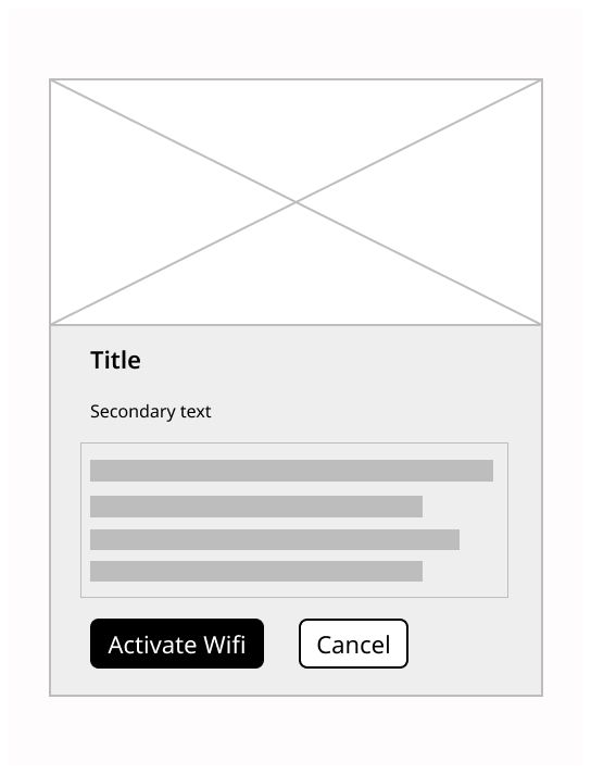
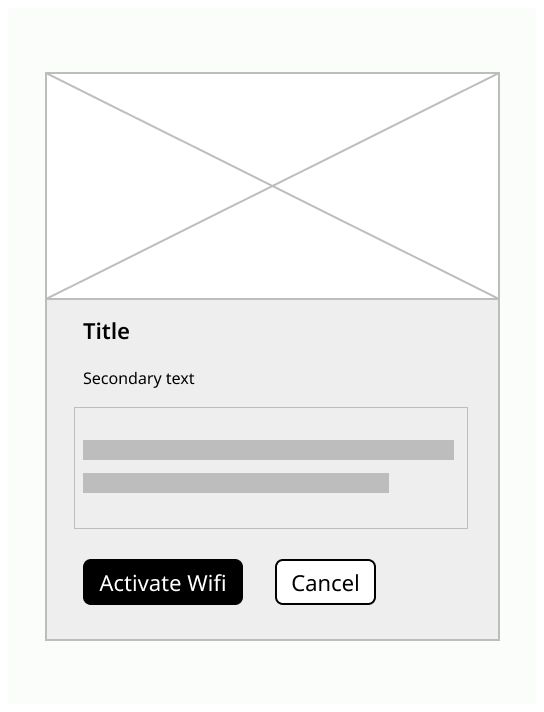
A card is composed by several components.
Picture: An image related to the subject
Contextual information: Help the user to know quickly the thematic of the card
Main content: Some texts that resume the page linked to the card
Actions: Some icons that can toggle various actions

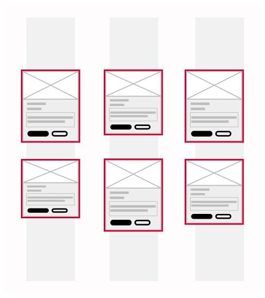
On mobile vertically, put one card per row and use the all the space of the screen. Horizontally, you can put two or three cards depending of the width of the screen.
Especially in mobile, gestures work well and add an element of fun. You can use swipe gestures to move cards and pick-up-and-move gesture to arrange a collection of cards.
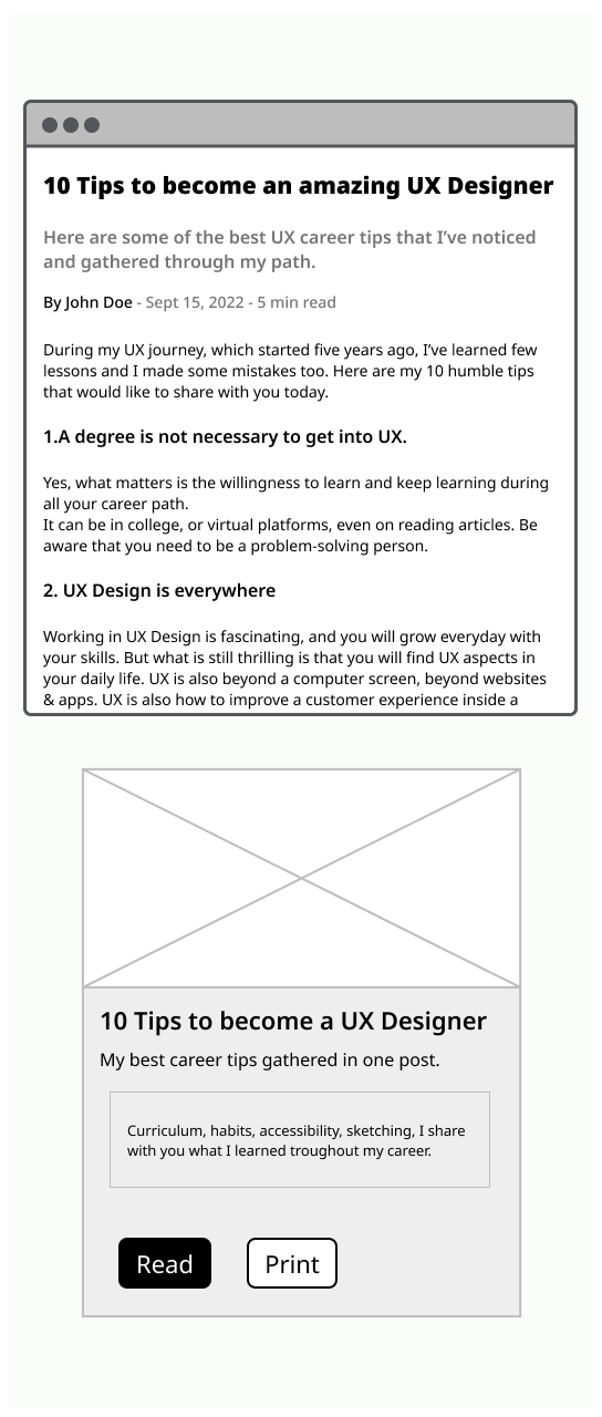
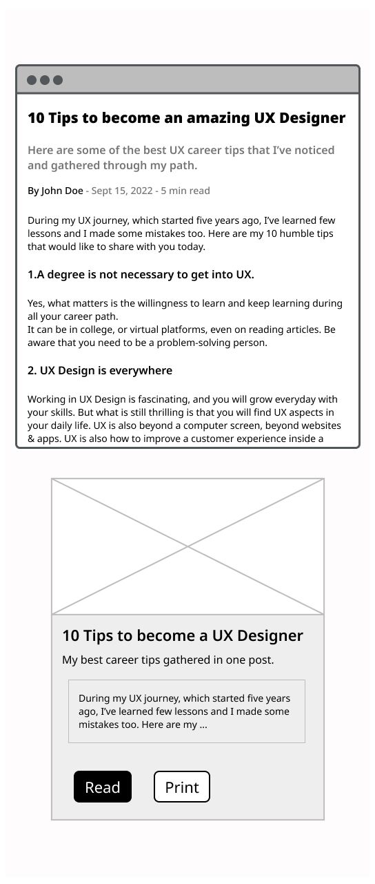
Only put essential information on the card Only one subject by card Don’t truncate text on a card, make it shorter