Do


Tooltips display informative text when users hover, focus, or tap/click an element.
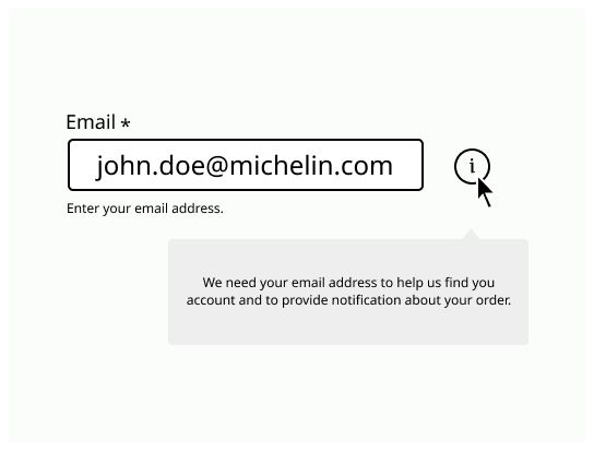
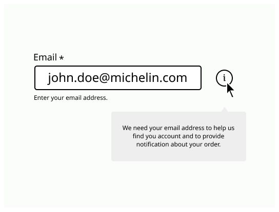
Tooltips are floating labels that briefly explain the function of a user interface element upon click, hover, or focus. The information should be contextual, useful, and nonessential.
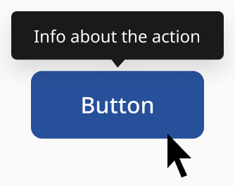
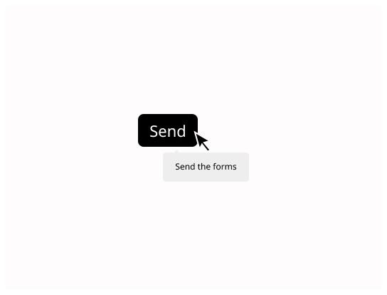
Use a tooltip to clarify the action or name or an interactive element such as an icon button whenever you consider it necessary. Content in these tooltips should be limited to one or two words.
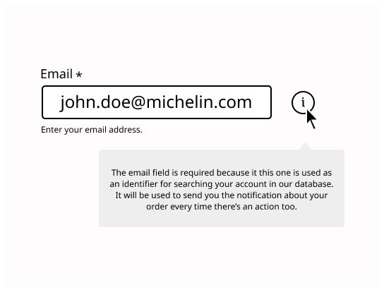
Use when you need to provide additional information on a non-interactive element, such as displaying content behind truncated text or defining a term in your interface. For these tooltips, content should be brief and limited to plain text.
Use tooltips sparingly. If a screen requires a lot of tooltips, work on clarifying the interface design and the content.
Tooltips replace standard desktop browser tooltips where more emphasis is required.
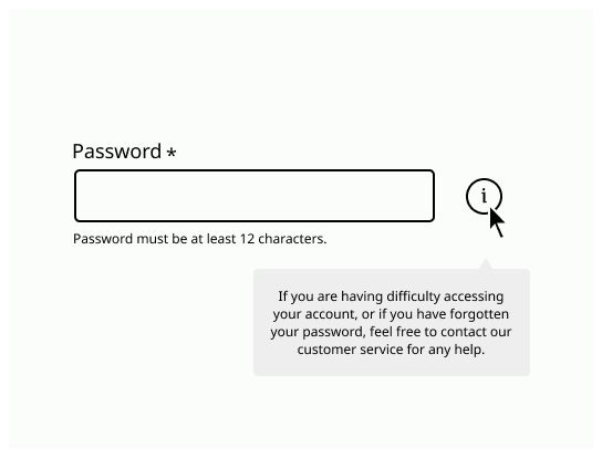
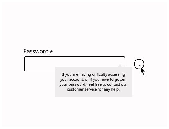
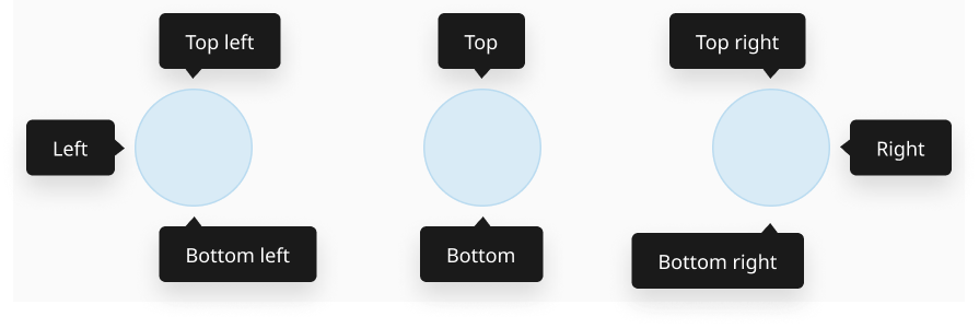
The position of tooltips is flexible and will change depending on how close the element is to the edge of a screen or container. By default, four options are available: top, right, bottom and left aligned.
Use tooltips when you need to provide a short description of a page element or control.
Place tooltips close to the element they are related to, it needs to be clear which element they are associated with.
Write content inside a tooltip in sentence case style.
Use breve label on the tooltip, prefer one or two words. Use a definition only when you can't say it with few words.
Don't use tooltip to give essential information to understand the interface, or for communicating critical information, including errors or other interaction feedback. Use a Notification or Alert instead.
Don't repeat the label in the tooltip.