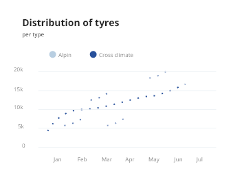
Scatter


A scatter plot uses dots to represent values for two different numeric variables. The position of each dot on the horizontal and vertical axis indicates values for an individual data point. Scatter plots are used to observe relationships between variables.
Introduction
Scatter plot are used for :
Show relationship
Show distribution Of Value
Recommandations for a perfect Scatter Plot :
Try to identify if the result will present too much dots (Usually when sample size is high).
Overplotting makes the graph difficult to read
Don't forget to show subgroups if you have some.
Usage
When to use
To show correlation and clustering in big datasets. If your dataset contains points that have a pair of values. If the order of points in the dataset is not essential. To observe and show relationships between two numeric variables patterns when the data are taken as a whole.
When to avoid
If you have a small dataset. If the values in your dataset are not correlated.
Be careful
This is not so much an issue with creating a scatter plot as it is an issue with its interpretation. Simply because we observe a relationship between two variables in a scatter plot, it does not mean that changes in one variable are responsible for changes in the other. This gives rise to the common phrase in statistics that correlation does not imply causation.
Anatomy
The objective is to visualise a large amount of data that are correlated.
A scatter plot is represented with :
a group of points that represents the data set.