Burger Menu

Angular

See content

Burger menus help users find their way around in the product through quick access to pages and features.

Usage

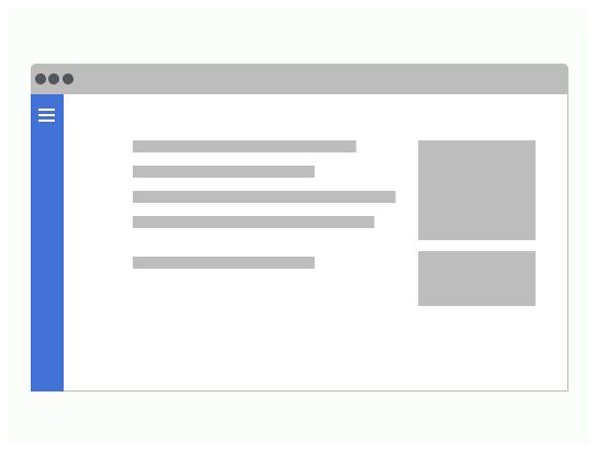
Use the burger menu component when the screen is too small to display the full menu.

When to use

In responsive mode, the menu will only be displayed when the user clicks on the burger icon.

Anatomy

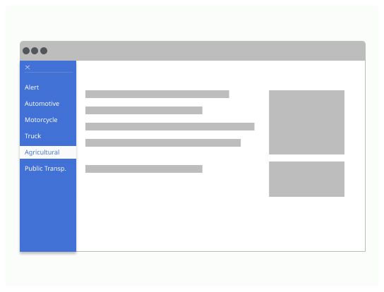
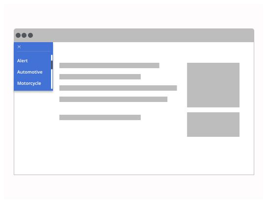
  1. Burger icon: On clicking, the menu rolls out and the icon turns into a cross

  2. Menu: A simple dropdown menu

Burger icon

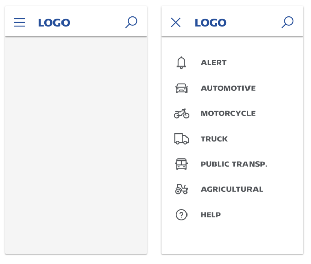
The burger icon should change into another icon or variation of the original icon to indicate that the user can click on it to close the menu.

Menu

The menu should stay on the screen until the user clicks on a link of the menu or press the cross or the escape key.
A burger menu has a lot in common with a dropdown menu.

Do’s & Dont’s

The user should be able to navigate the menu with their keyboard. 

The menu should be displayed until the user either  
- clicks on a link of the menu or the cross 
- presses the escape key. 
Use a burger menu similarly to a dropdown menu.  

Do

Place the burger menu in one of the upper corners of the screen.

Don’t

Do not place the burger menu at the center of the screen.

Do

All items should be visible without scrolling in the side menu.

Don’t

Avoid scrolling in the menu.

Log in

Log in with Michelin ID

To connect to the Design System, I will need:

  • A Michelin ID (e.g. F012345)
  • Double authentification (with the NetIQ application or by SMS)
  • A password associated with your Michelin ID

I don’t have a Michelin ID and/or email

In order to connect to the Design System, I need:

  • A user ID or an email
  • A password

If you have never accessed the Design System, you can request access via this link.