Do

Carousels are dynamic modules showing a collection of items one at a time by using a navigation system (“Previous” and “Next” buttons) and a pagination system that control the displays of scrolling panels, sometimes automatically. In the case of auto scrolling carousel, the module is accompanied with a play and pause system.
It allows your users to have access to a gallery of content such as images, teasers, articles, products or more complex content.
Use a carousel when you have a large amount of content to display on the same important piece of a page. The content to be displayed is usually important content to highlight.

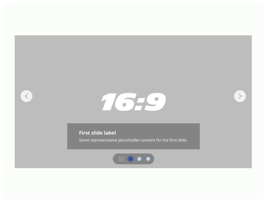
Navigation button: Buttons previous and next, placed on each side of the content in order to navigate between the different slides.
Your image(s): this is where your content is going to be located: it could be an image, a video, the preview of an article or a product.
Overlay: In order to prevent issues from reading text, you must place an overlay on top of your content to make sure that your users can read it.
Title: a small title that best describes the message you want to share.
Description: a quick description of your content.
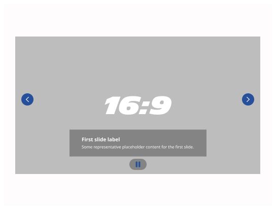
Play / pause button: A button that allows user to pause or play the auto-animation of the slides.
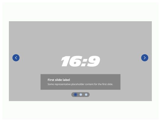
Navigation dots: small buttons and indicators for the users to understand on which page they are on and how much of them there are.
Generally, carousels are prominently located and are used to provide browsing or display page content. The Carousel is usually based in an important section of your page. It could either be in the hero section which is the very first section of your page or even just below this one or at the very bottom of your page just above the footer section. Of course, you can choose to put your carousel else where on your page, but don’t forget that carousel is done to display important information for the user and that you want to drag his attention.
Before using a carousel, question the interest of using this component and if you can really need to use an image: you need to follow the path of your users as much as possible.
Try to keep in mind to:
To be simple, frugal and efficient.
Focus on functional units that brings value to the users
Limit the number of clicks
Limit the time spent by the user on the application to find what he needs
What is the maximum display size for my users ?
Can I redesign my page to display my image in a smaller size without compromising the design ?
Can text replace certain types of images ?
Which images can be dispensed with (not useful for understanding the service) ?
Does the animation carry a specific message ?
Can it be replaced by any infographic or a static image ?
Is the frequency of the animation appropriate for the functionality ?
To have an accessible carousel you have to make sure to these different points are respected:
People using keyboard navigation and voice input software can navigate between individual items.
Screen reader users will know what is currently displayed and how to navigate through the elements.
People who are distracted by motion can interrupt animation.
People who need more time to read can interrupt the animations, allowing them sufficient time to read and understand the carousel content.
People with visual disease will not be able to read only the text in your image, that is why it is important to fill the description of the image in the alt-text tag.