Do

A modal is a window displayed on top of all content, requesting information or action from the user.
Modals are triggered by a user's action and display content in a layer above the app. Modals interrupt a user's workflow by design. When active, a user is blocked from the on-page content and cannot return to their previous workflow until the modal task is completed or the user dismisses the modal. While effective when used correctly, modals should be used sparingly to limit disruption to the user. Modal dialogs are commonly used for short and non-frequent tasks, such as editing or management tasks. If a user needs to repeatably perform a task, consider making the task do-able from the main page.
Use a modal if the action can have serious consequences.
Use a dialog to request information that is preventing the system from continuing a user-initiated process.
Use a modal dialog to notify the user of urgent information concerning their current work. Modal dialogs are commonly used to report system errors or convey a consequence of a user's action.
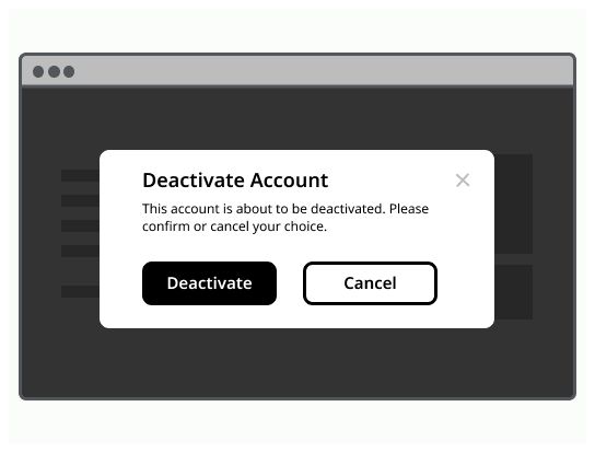
Use a modal dialog to confirm user decisions. Clearly describe the action being confirmed and explain any potential consequences that it may cause. Both the title and the button should reflect the action that will occur. If the action is destructive or irreversible then use a transactional danger modal.
Modal example can vary depending on the user's needs, but should always at least encapsulate a title, a body content and a cross to close it. Clicking outside of the modal, on the overlay, should allow to close it.
Container: The body of the modal
Title: Title of the modal
Body: Contains the information and/or controls needed to complete the modal's task. It can include message text and components.
Action button(s) (optional): Call To action
Cross: Allow the user to close the modal without submitting any data.
Overlay: Screen overlay that obscures the on-page content.

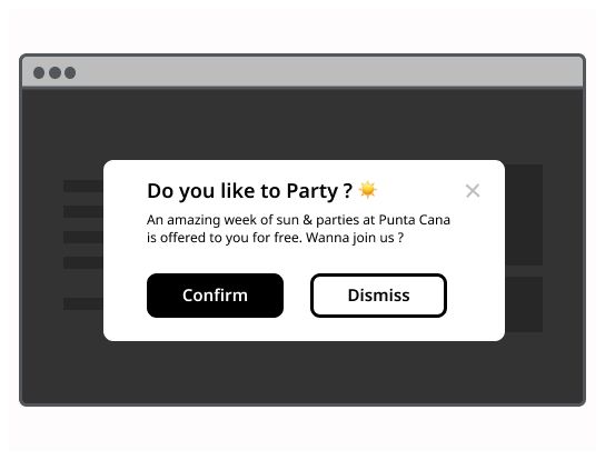
An information modal informs the user about something. The user has nothing do except read the content on the modal. If you want to make the information disappear with a display duration, use an alert notification component.
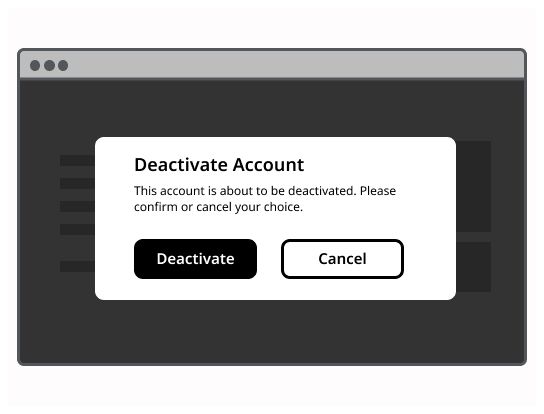
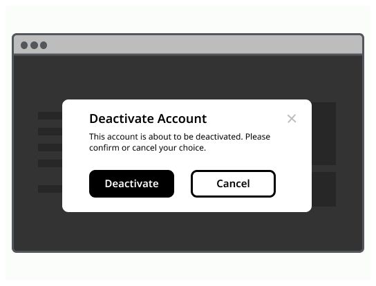
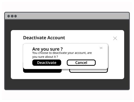
A confirm dialog asks a user to verify whether they want to proceed or cancel a requested action. The confirm dialog must be attended before the system executes the command. A confirm dialog could be used for example for a delete action, a replace action, a purchase action, ... Use it when the user asks the system to do an action with important consequences. It may avoid error by demanding the user to check what he wants to do.
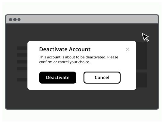
It is a specific type of confirmation modal, used for irreversible actions. The validate button is replace by a danger button. You must explain clearly to the user that the action he attempts to do irreversible.
This type of modal is used when the system required that the user has read/accepted a set of rules for example. It contains the rules, a checkbox to confirm that the user is agreed with the rules and the validation button.
A modal takes place in the middle of the user screen above the interface with an overlay to obscure the rest of page content.
Use modals sparingly and only for workflow related tasks.
A modal is always triggered by a user action (direct or indirect), use toast notification for system alerts.
The user must be able to close the modal with the escape key.
Don't use modal to display complex or large amounts of data.
Don't use modal if the user needs additional information outside of it to complete the task.
Don't recreate a full app or page in a modal.
Don't make the modal of the size of the screen.
Don't nest modals.