Stepper

Angular

See content

Blazor

See content

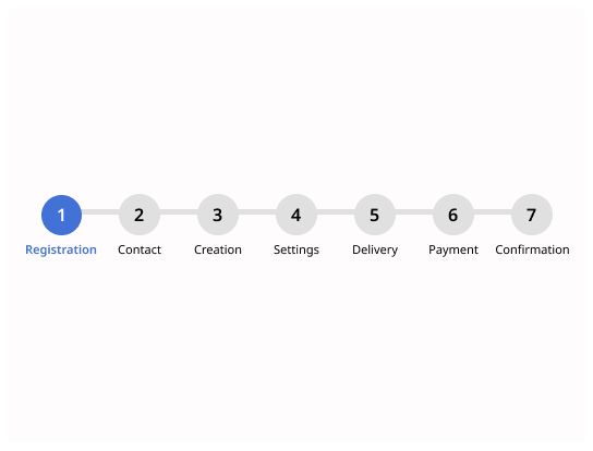
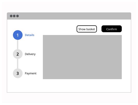
Stepper provides a wizard-like workflow by dividing content into logical steps.

Usage

A stepper is also called a “progress indicator” or a “wizard”. It is a visual representation which indicates to the user his progression step by step through a process. It divides content into logical steps.

When to use

Use steppers to help users keep track of their progress when completing a specific task divided in a set of steps. Steppers display to users where they are in the process and can be used to navigate through the process by selecting steps. The process must have two or more steps. It shouldn’t be used for dividing forms into multiple steps

Types

Linear

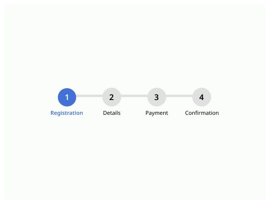
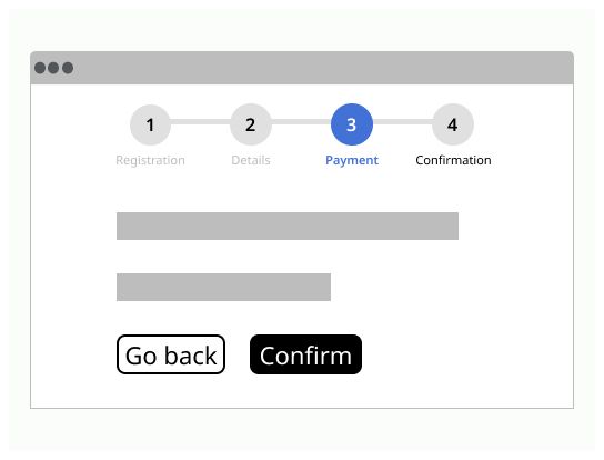
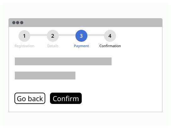
Linear stepper requires users to complete one step to move on to the next. Steps follow a specific order and users cannot skip a step. Users can still navigate back to a previous step.

Non-linear

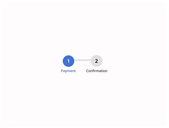
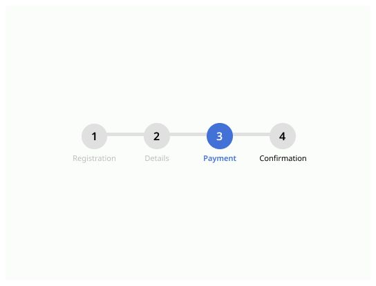
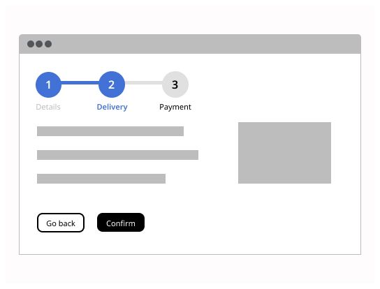
Non-linear stepper allows users to complete the steps in random order. Users can navigate to any step.

Placement

Steppers can be placed in different containers such as widgets or modals. Placement is dependent on use-case, but the general guideline is for them to sit at the top of the container, taking full-width space and close to related information in the page. To know how to organize a step, look the different guidelines on form components.

Do’s & Don’ts

Do

Use a stepper between 3 until 6 steps. For less than 3 or more than 6 steps, consider using another component or process.

Don’t

Don’t use a stepper with more than 6 steps. If as task needs more that 6 steps, consider simplifying the process of breaking it up into smaller tasks.

Do

Use a stepper between 3 until 6 steps. For less than 3 or more than 6 steps, consider using another component or process.

Don’t

Don’t use a stepper with less than 3 steps. Please consider another component or display if you have 2 steps.

Do

Display the steps in logical progression, from left to right.

Don’t

Don’t begin the stepper to the left and complete it to the right.

Do

On stepper, always show in a significant way the current step: it will give a marker and control to the users.

Don’t

Don’t use the same colors and style for the current step.

Do

The user must be able to go back or confirm to go to the next step.

Don’t

Do not restrict the user in the stepper progression. Give the user the possibility to go back to previous step.

Do

Make sure to use short and concise names for every steps.

Don’t

Don’t use long names for steps, instead be short and concise.

Do

Use steppers for helping users to keep track of their progress when completing a specific task divided in logical steps.

Don’t

Do not use stepper as a localisation navigation for the users. Use a breadcrumb instead.

Do

Always use the same style for the stepper inside the whole tool in order to be consistent.

Don’t

Do not swipe the placement of the stepper between a step progress. Always stay at a vertical or horizontal mode until the end.

Do

Action buttons for progression on steps should be put below the last content of the step.

Don’t

Do not place the action buttons for progressing on steps at the top of the page.

Log in

Log in with Michelin ID

To connect to the Design System, I will need:

  • A Michelin ID (e.g. F012345)
  • Double authentification (with the NetIQ application or by SMS)
  • A password associated with your Michelin ID

I don’t have a Michelin ID and/or email

In order to connect to the Design System, I need:

  • A user ID or an email
  • A password

If you have never accessed the Design System, you can request access via this link.