Visual design
Introduction
Visual design aims to improve a product’s aesthetic appeal and usability with suitable images, typography, space, layout and color. Visual design is about placing elements carefully to create interfaces that optimize user experience and drive conversion.
It aims to increase usability. And when paired with a strong interaction design, visual design will increase task success rates and user engagement.
This concept can be organised in two categories :
the elements of visual design
the principles of visual design
Principles
Elements of visual design
Any page or screen in a digital product can be broken down into fundamental elements of visual appearance.
Line Shape
Color
Volume - Size - Proportion
Texture
Typography
Negative space
Focus on typography
How typography can be important in Datavizualization ? Typography is the size, alignment, color, and spacing of a font.
Apply to your dashboard
Use at maximum 2 differents fonts to show differences but to keep harmony in your report.
Use 2–3 font sizes to structure reports between them but also to structure chart itself.
Principles of visual design
After discovered elements of visual design that describe the building blocks of a product’s aesthetics, principles of visual design tell us how to use those elements together for the best results.
The list of this principles :
Unity
Balance
Hierarchy
Scale
Contrast
Emphasis
We can add the Gestalt principles.
Focus on hierarchy
How hierarchy principle can be important in Datavizualization ?
The principle of visual hierarchy refers to guiding the eye on the page so that it attends to different design elements in the order of their importance. Visual hierarchy can be implemented through variations in scale, value, color, spacing, placement, and a variety of other signals.
Why ?
Because dashboard present a large amount of information in a limited amount of space.
Apply to your dashboard :
Use layout to create a hierarchy between data.
Use title and subtitle with different size of font to create understandable context to your data.
Focus on Contrast
How contrast principle can be important in Datavizualization ?
Contrast refers to the level of difference between design elements in order to create visual hierarchies... The variation makes certain elements stand out more than others. You can apply contrast by using colors, textures, sizes, and shapes.
Apply to your dashboard :
Use colors with high level of contrast to stand out alerts or important information.
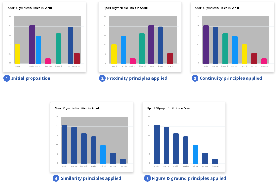
Focus on Gesalt
How Gestalt principles can be important in Datavizualization ?
Gestalt principles refer to visual perception theories. The original intent of the research was to uncover how our brain perceive pattern, form and organization.
These principles capture our tendency to perceive the whole as opposed to the individual elements.
Because users must be able to understand what they see—and find what they want—at a glance, especially in a report, Gestalt's principles can help the visualization of data and make the point stand out
Continuity
We perceive objects that are in line or seem to be a continuation as part of a unique group, whether that is true or not.Proximity
We perceive objects close to each other as belonging to a group.Similarity
We seek similarities and differences and link similar items into a group.Figure and Ground
We tend to segment our visual world into figure and ground. The figure is the object in the focus of our vision, and the ground is the background.Symmetry
We feel order and hierarchy when objects are organized symmetrically.Common fate
We perceive objects as a group when they share a direction of placement of seem to be moving together.Closure
We recognize shape by making connection whether it is relevant or not.Common region/Enclosure
We perceive objects as belonging to the same groupe when we perceive them close from each other
Applied example: