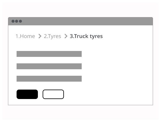
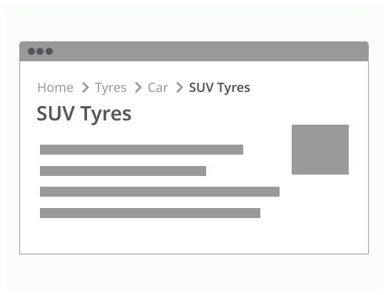
Do

Breadcrumbs are a secondary trail of navigation for the user.
Breadcrumbs help the user navigate a website or an app by showing the path they have followed to access the page. Breadcrumbs show users their current location in the site, enabling them to quickly move up to a parent page or trace the path back to their original landing point.
Use breadcrumbs on systems with hierarchies deeper than two levels, to supplement the global navigation bar and clarify the structure of the site or app.
The type should be consistent in the product.
It bases on the site hierarchy. It shows to the user where he is on this hierarchy. It is the most used type of breadcrumb.
It is dynamically generated. It shows the path the user uses to go to the actual page.
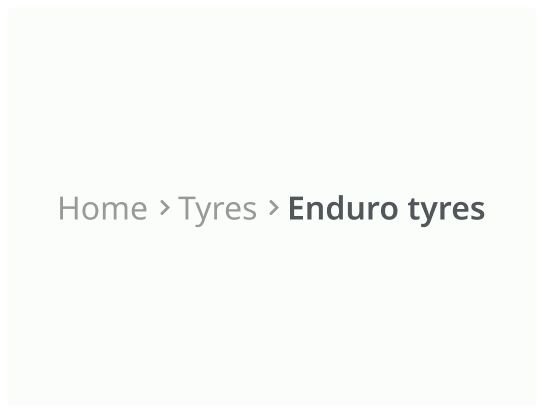
It bases on the criteria selected by the user to find a product.
The user can click on the breadcrumb to navigate.
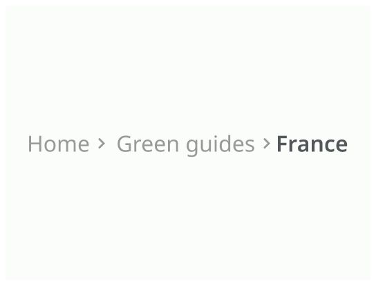
Home: Link to the first page of the website/application.
Link: The name of the parent page or the previous page and a link to it.
Separator: A simple symbol to the separate the different links of the breadcrumb.
Active page: The page where the user is. There is no link on this page and this is the last element of the breadcrumb.
The breadcrumb is on the top left of the page, above the main content of the page and under the header and the main navigation elements.
Don’t replace the main navigation with a breadcrumb.
Don’t use breadcrumb to show progress through a process, use a stepper component instead.
If the breadcrumb does not feet on one row, you can collapse it.
When the user will click on the “…”, the breadcrumb will be showing the entire breadcrumb trail.
If a page has multiple parents, only show the main one in the breadcrumb.
On mobile, only show the last page of the breadcrumb to have only one row in the breadcrumb trail.
If the link has only an icon, add an aria-label and/or a title with the name of the target page.
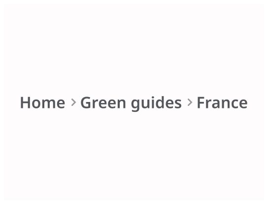
The type, weight or size of the active page, in addition to the color, must be different from the links in order to clearly differentiate them and better understand that it is the active page.
