Do

A spinner is a simple animated component which indicate a loading.
A spinner attracts the attention of the user.
The activity indicator can be used in place of the indeterminate progress bar when you want to take up less space. It is ideal to use when a small area of the screen is being updated rather than the entire window.
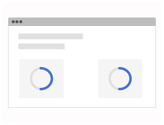
If this component is displayed while something is loading, place the component in the place where the content will appear once it has loaded.
The label describing the activity can be included if there is enough space, because it gives useful information to users about what is happening. The label can be removed if the available space is small, for example if the component is displayed in a small area while a thumbnail image is downloading.
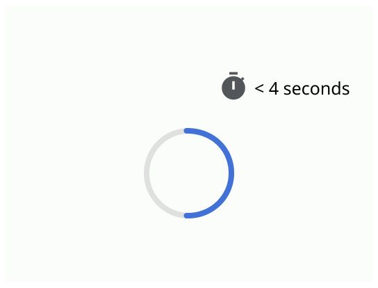
Use it to indicate a short loading in a page and when the wait time is less than 2 seconds.
If you need to load an entire page, use empty state.
Spinner
The spinner should be placed on the loading element and disappear when the element is loaded.
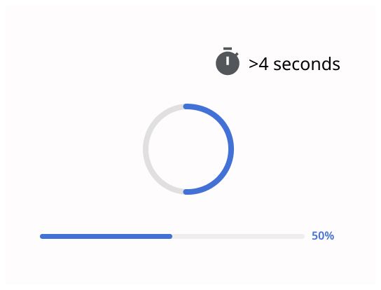
Inform the user that the activity is under way and try to give information on the progress.
Add a button to cancel the activity if > 4 sec


